COVER
MAGAZINE DOUBLE PAGE SPREAD
COVER
MAGAZINE DOUBLE PAGE SPREAD
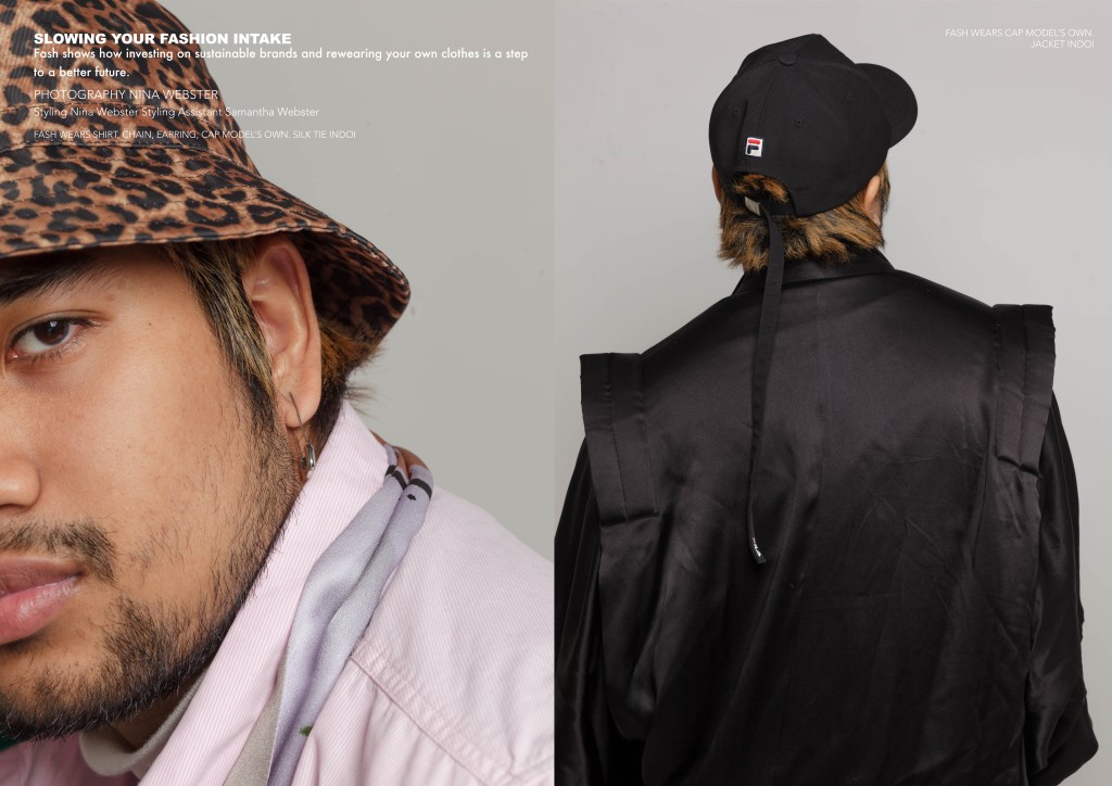
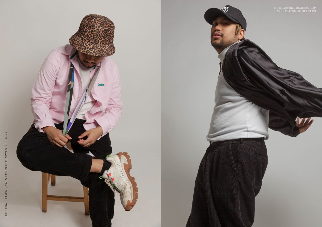
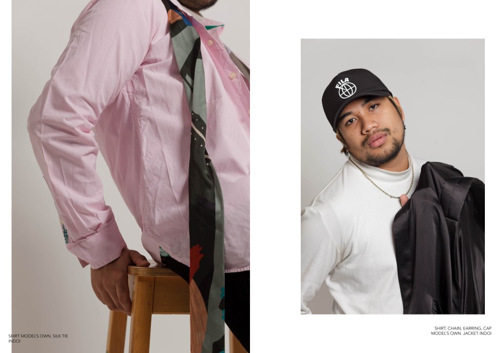
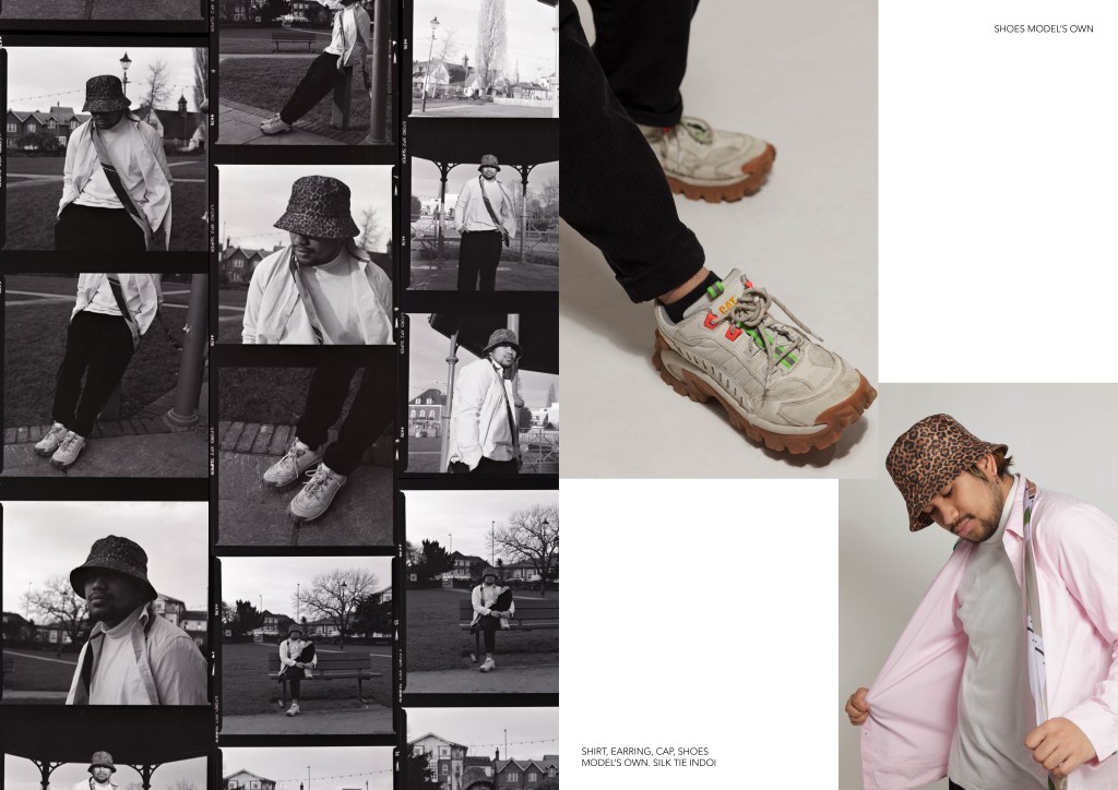
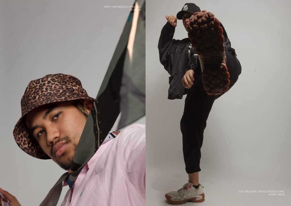
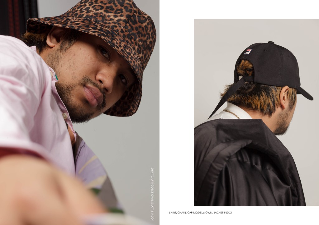
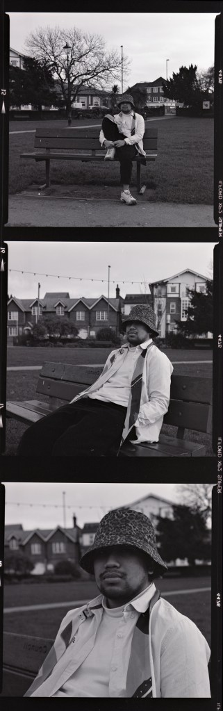
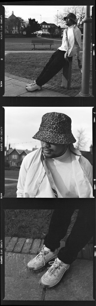
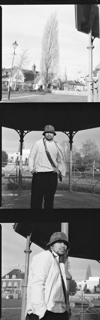
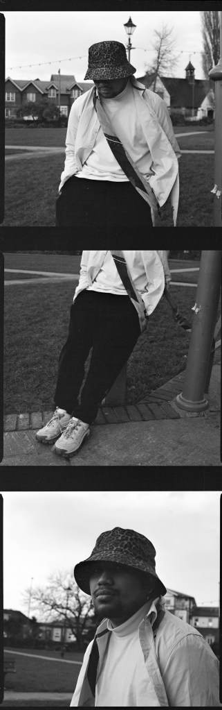
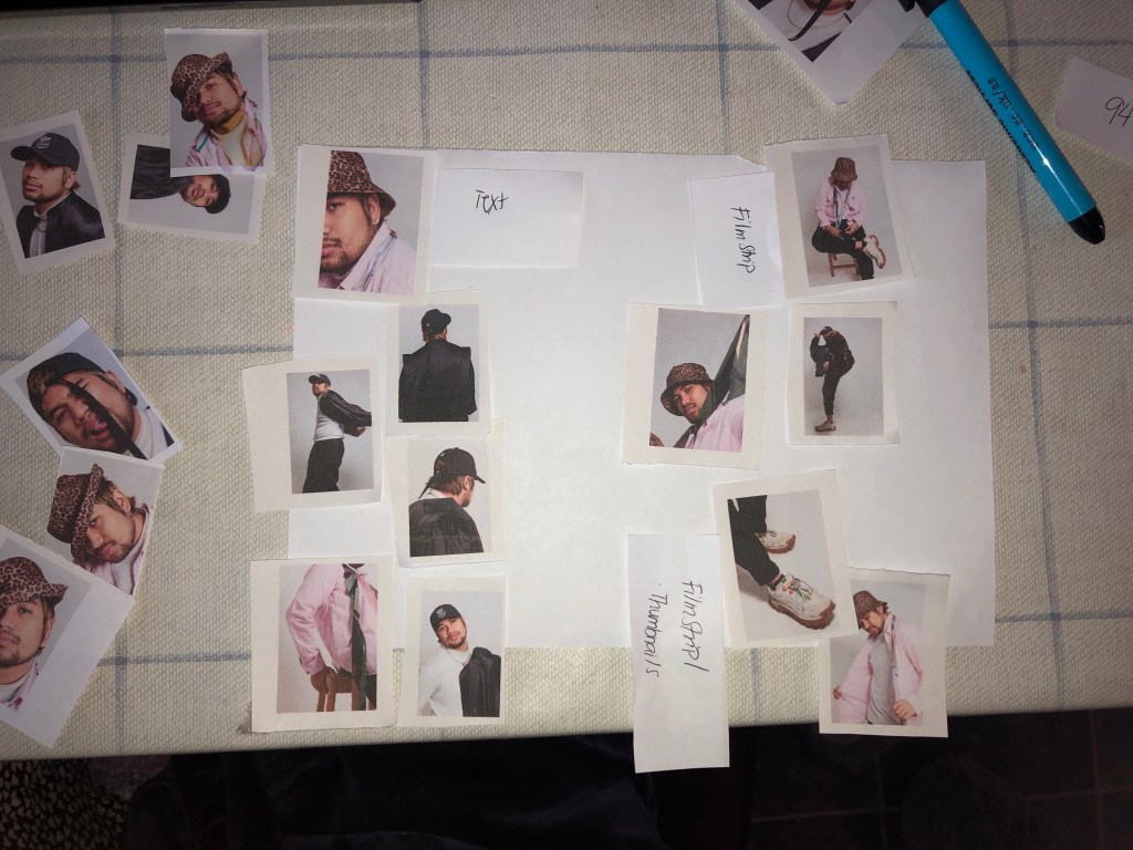
For the layout I decided to go for the single image per page with the exemption of the film photos (below) that I’ll edit to serve as contact sheets.
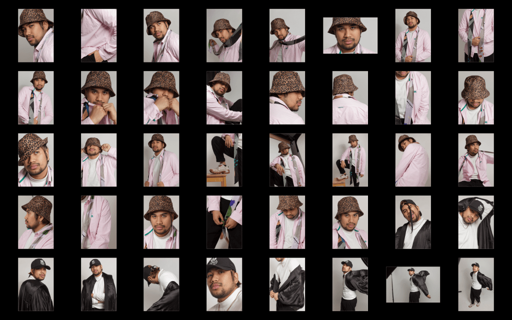
To help me have a better understanding on which pictures to use for my magazine layout I printed out the final edited jpegs into thumbnails as I find it easier to have a physical copy of the images and move them around freely if I ever change my mind.
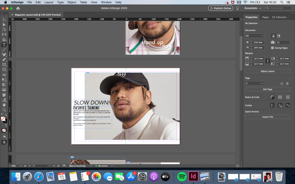
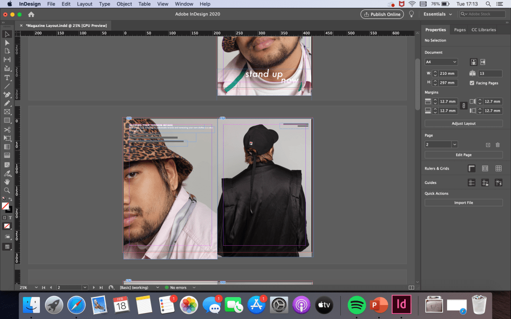
Indesign was a software I didn’t have any prior knowledge with. I was unable to attend the first workshop on the software and the second session didn’t go well due to the internet going down on the day. Therefore, I scoured through myUCA and found a helpful step-by-step on how to use it.
Below are some screenshots during the editing process.
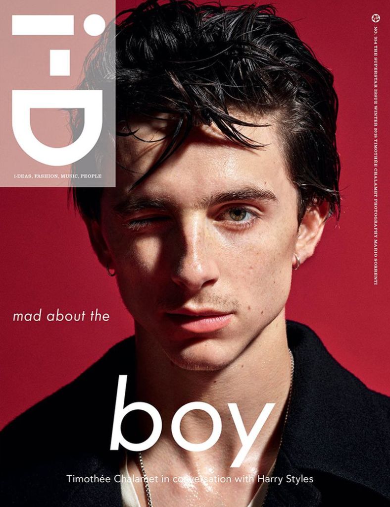
I wanted my magazine layout to sort of replicate the Winter 2018 i-D cover with Timothee Chalamet as to me it stood out the most through its bold typography, layout and imagery.
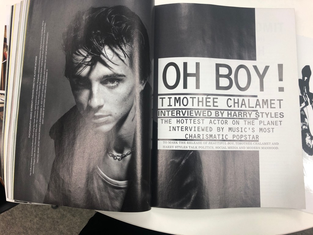
Wanting it to resemble the aforementioned magazine spread, I felt that it didn’t work because it felt too forced or rather I’m plagiarising Mario Sorrenti (photographer) and Alastair McKimm’s (fashion director) artistic choice.
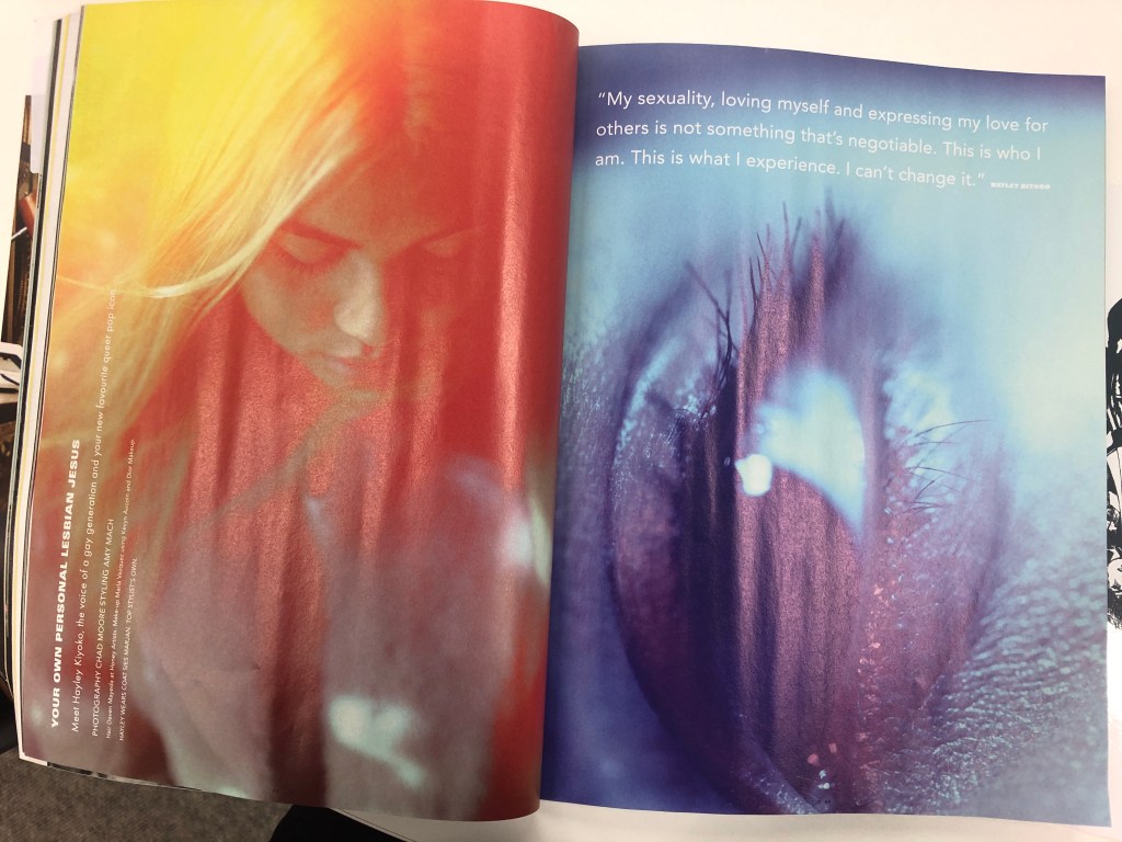
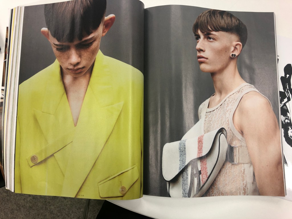
Therefore, I referred back to my printed layout guide to experiment with my own spread and opted for the simple and subtle route like Hayley Kiyoko’s spread below.
Previously, I mentioned that my initial shoot did not work out and I’ve researched and learned how to create a better solution for my final shoot.
After watching a few YouTube videos, I (badly) drew a lighting setup guide to help myself achieve the minimal shadow lighting I want shown in a some i-D magazine covers.
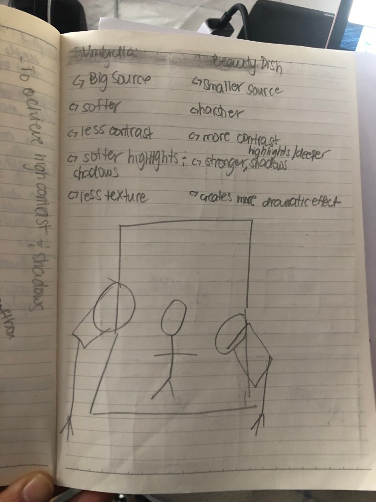
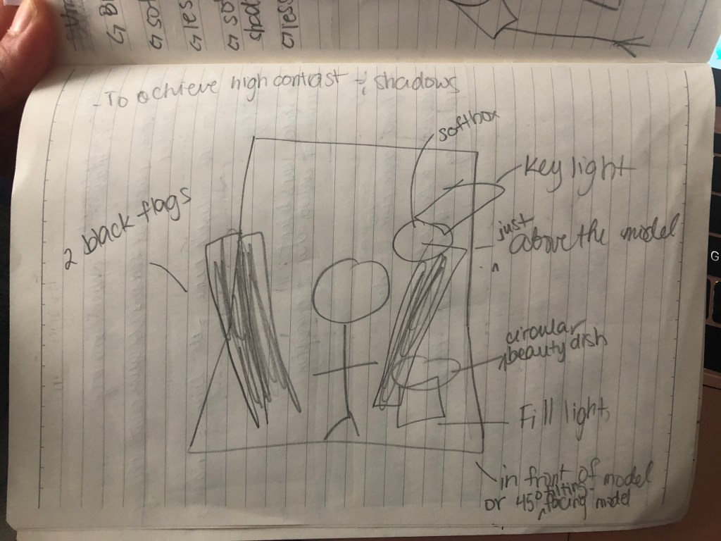
Through the tutorials, I learned to either use a beauty dish or an umbrella to achieve the look I’m going for. However, I thought of combining the two, having the beauty dish slightly in a 45 degree angle above the model as the key light and the umbrella to act as the fill light also in a 45 degree angle on the right hand side of the model as well as two white flags on either side to bounce back the lights creating a less to no shadows while playing with the intensity as well.
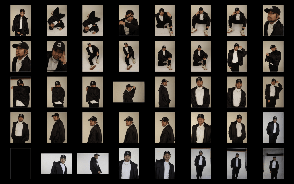
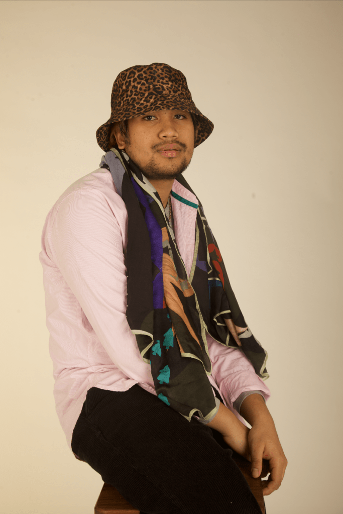
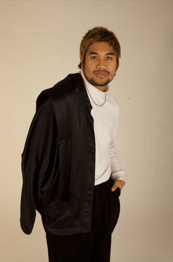
Below are edited batch results from my final shoot which I was pleased with.
Initially this was meant to be my only shoot for the project, however, I wasn’t pleased with the outcome of the lighting. As mentioned, I wanted the lighting setup to either be rembrandt or quite high key with minimal to no shadows. Although the outcome resulted to minimal shadows, it gave my pictures a yellow cast no matter how much I increased the intensity if the light. Also, I didn’t like how the ceiling was too low making it not possible to heighten the position of the lights.
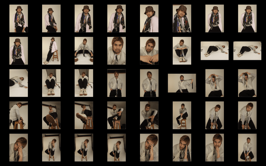
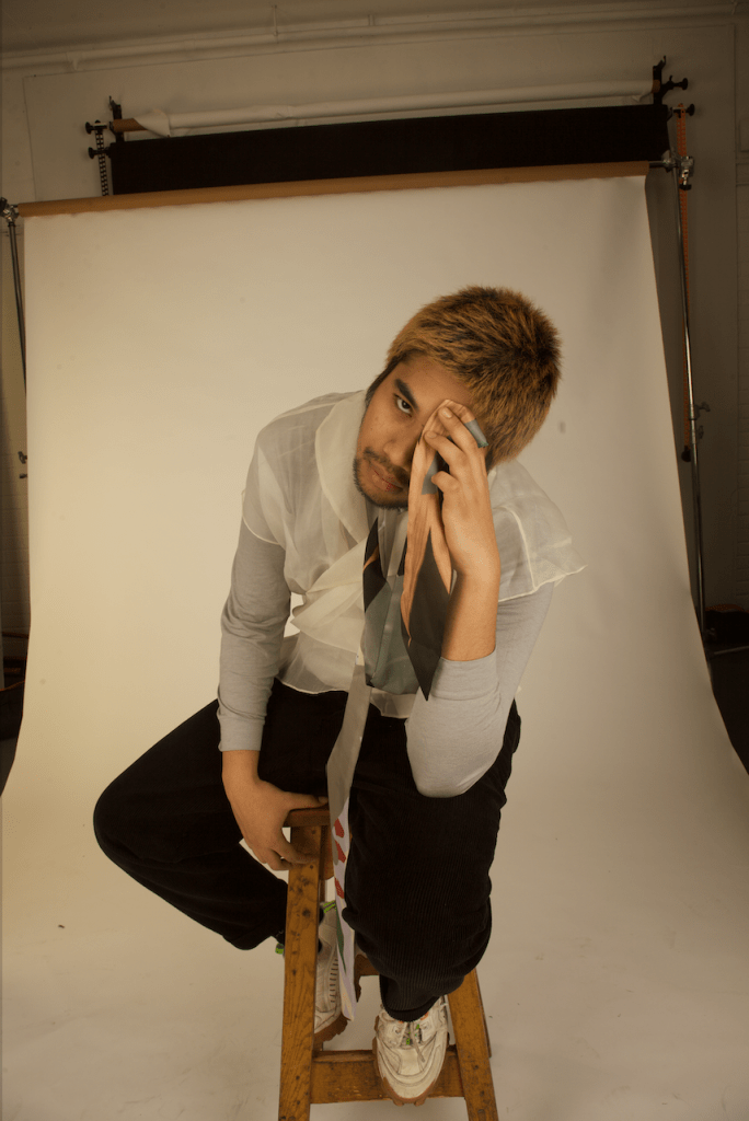
Below is a closer look of examples from the shoot:
I had no choice but to ask my model if I could reschedule another shoot and I decided to do it outside of the university since the studio (1) was not available the day my model was free and Rochester is quite far and expensive for him to come back again.
After this mishap, I watched tutorials on how to achieve a lighting setup using one or two light sources to give me a clearer idea on how to set it up next time.


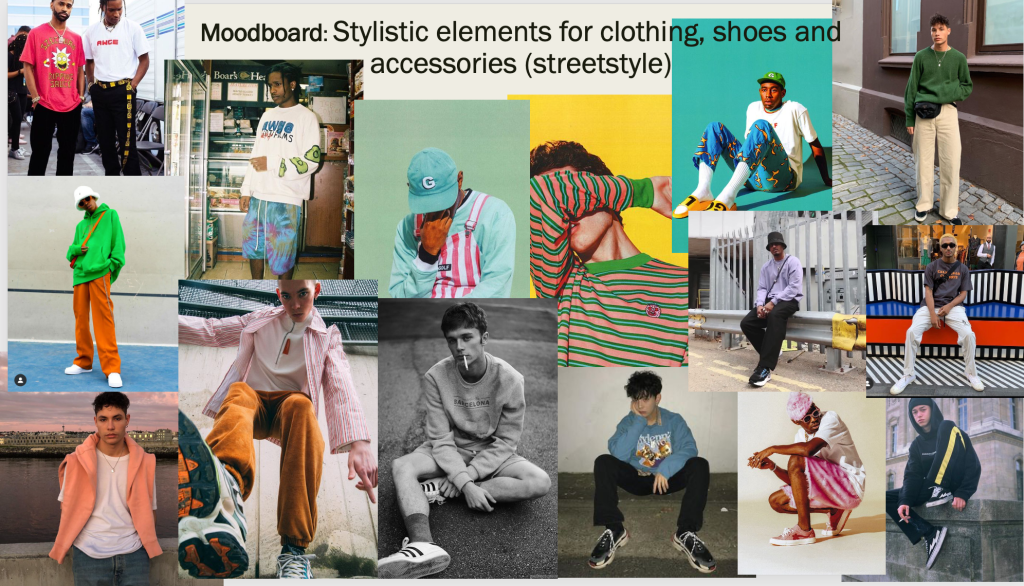
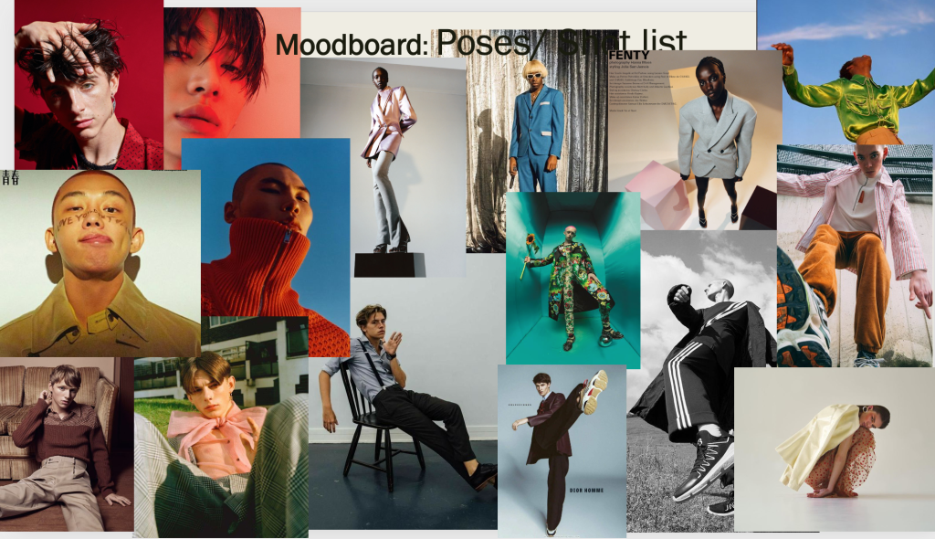
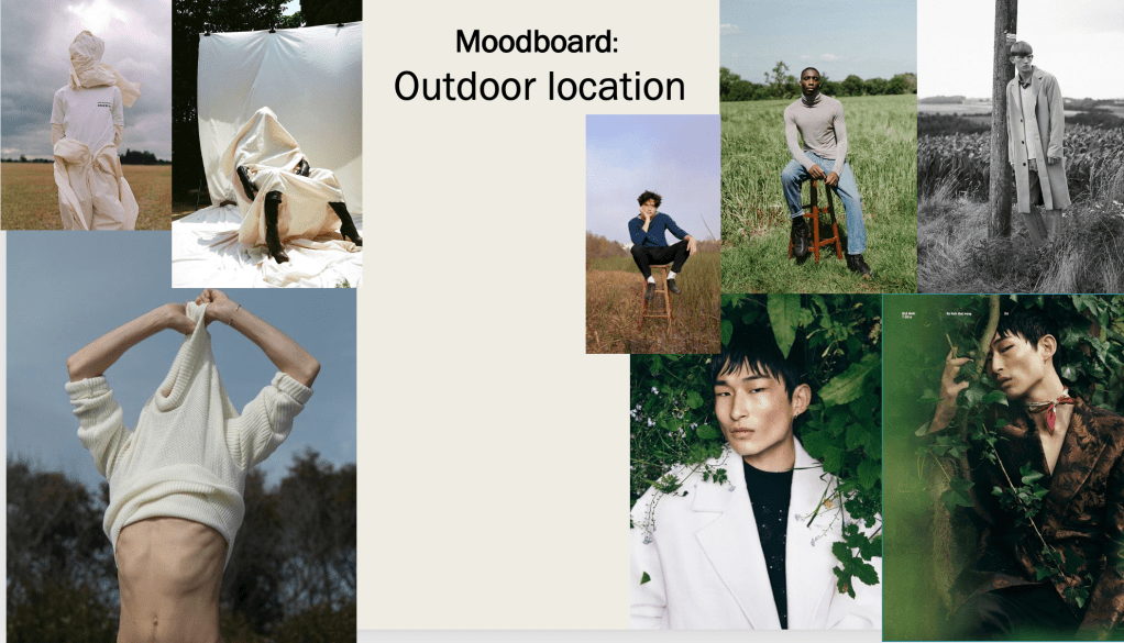
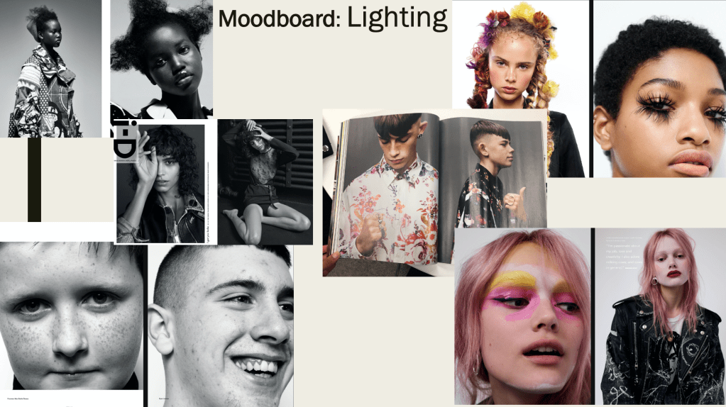
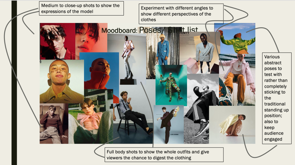
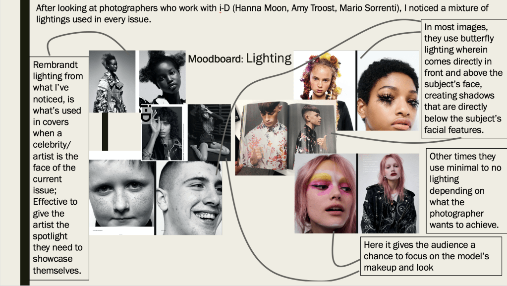
Below are moodboards and its explanation my shoot is going to be based on:
After looking at single image per spread layouts and multi-image double page spread. I drew possible layouts for my own double page spreads:
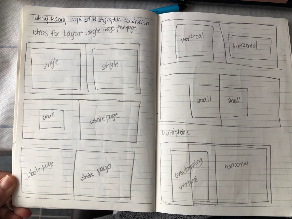
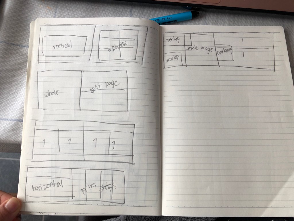
These layouts are based on most i-D magazines double page spreads I’ve looked at as shown below:
Single image per spread:
Multi-image layouts:
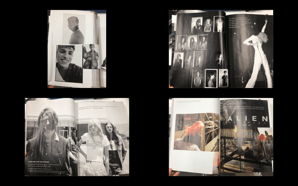
As mentioned on my previous post, I chose i-D as my magazine publication. And with this I’ve browsed through recent issue to base my own magazine on.
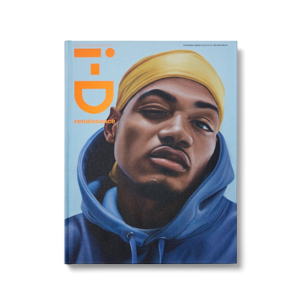
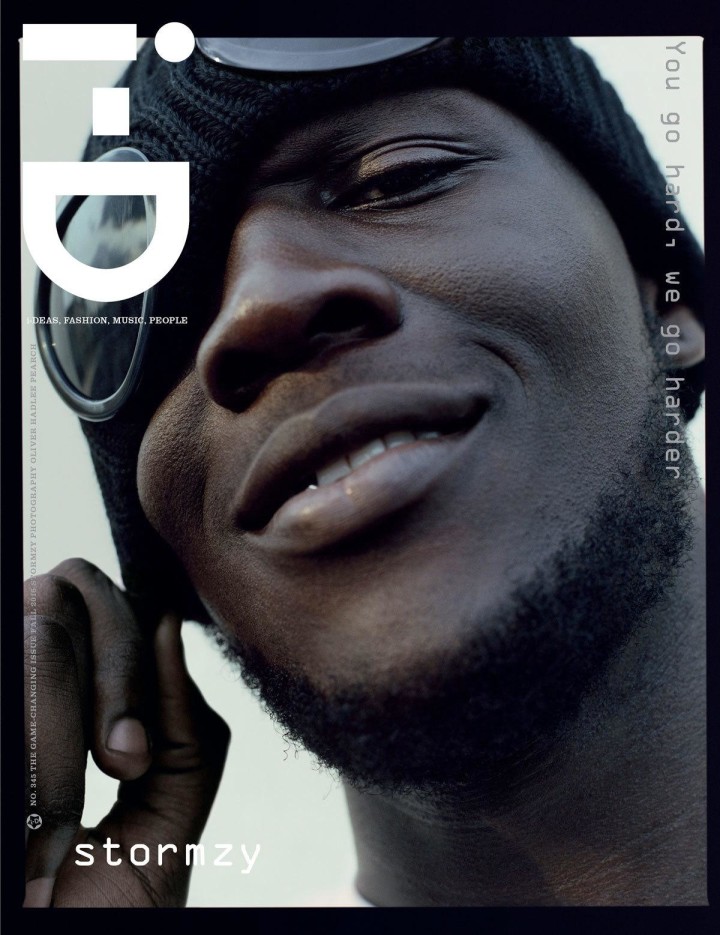
Covers
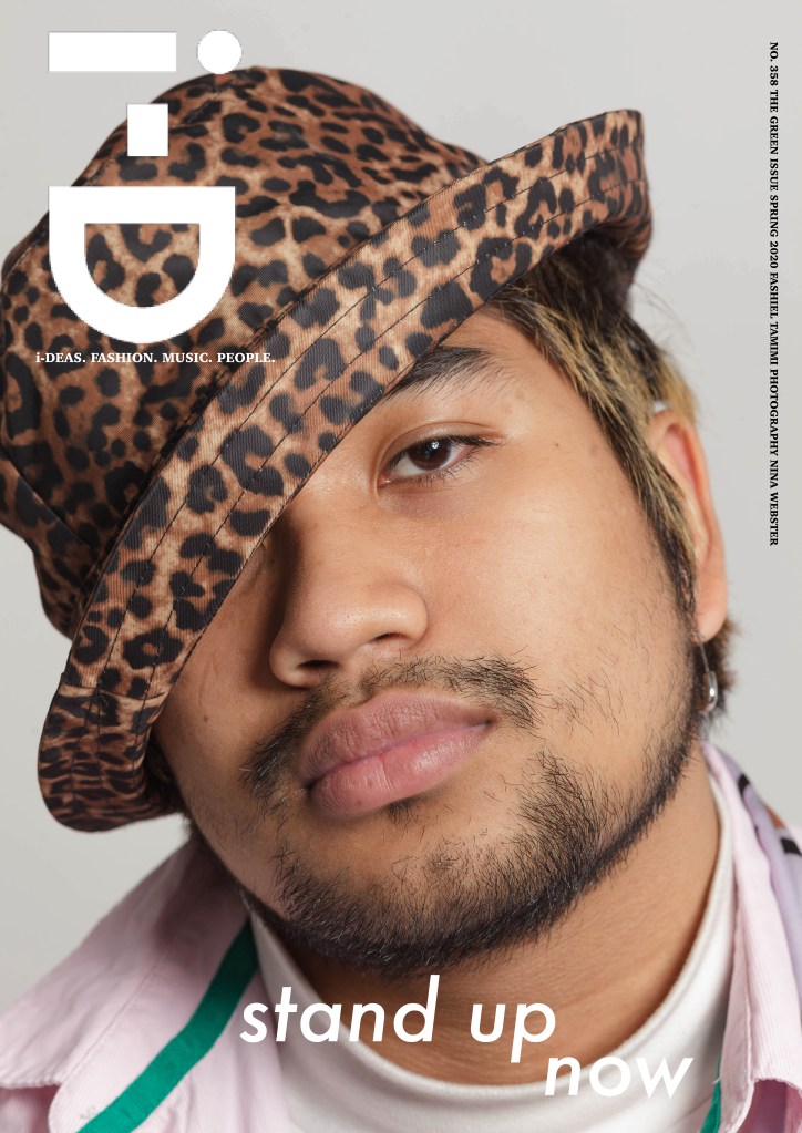
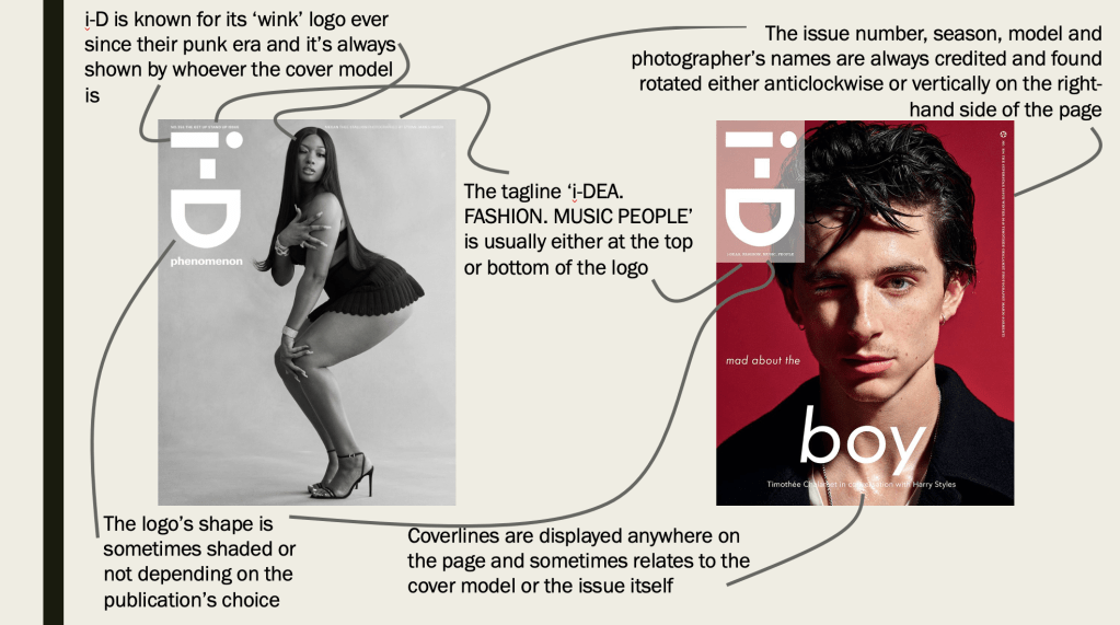
I’ve looked at the decade of 2010-2019 and analysed the layout of the covers, what makes i-D magazine stand out.
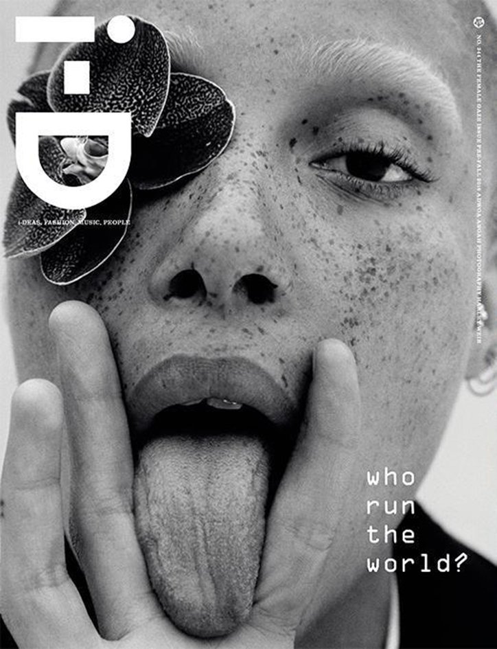
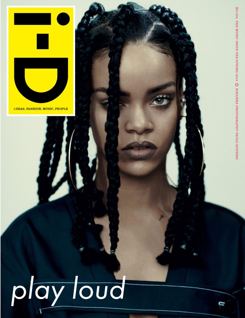

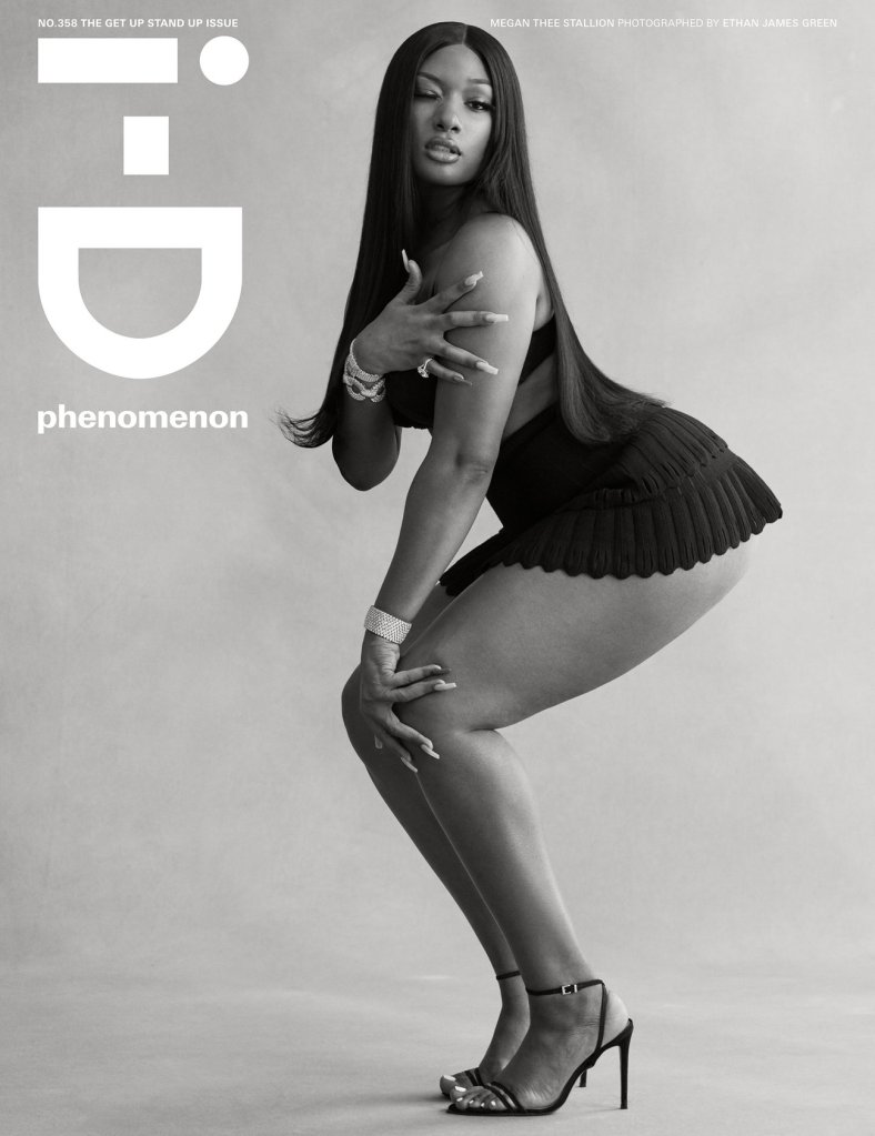
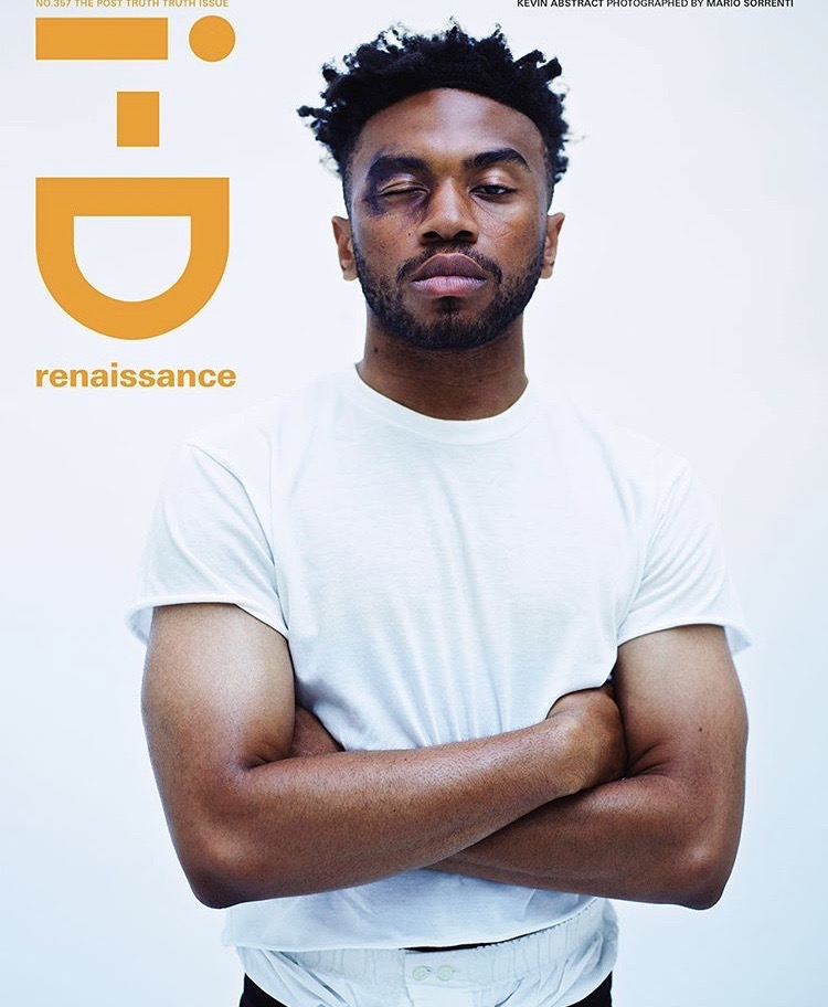

Below is an analysation of the two i-D covers.
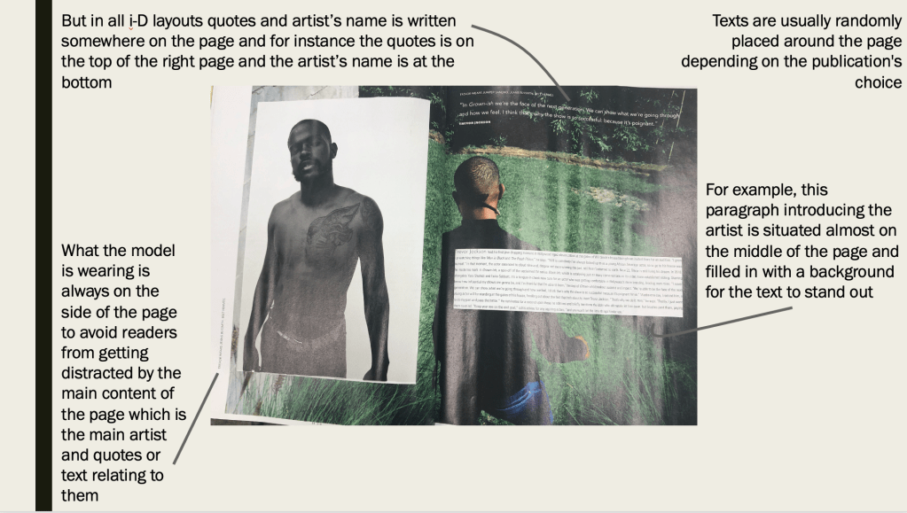
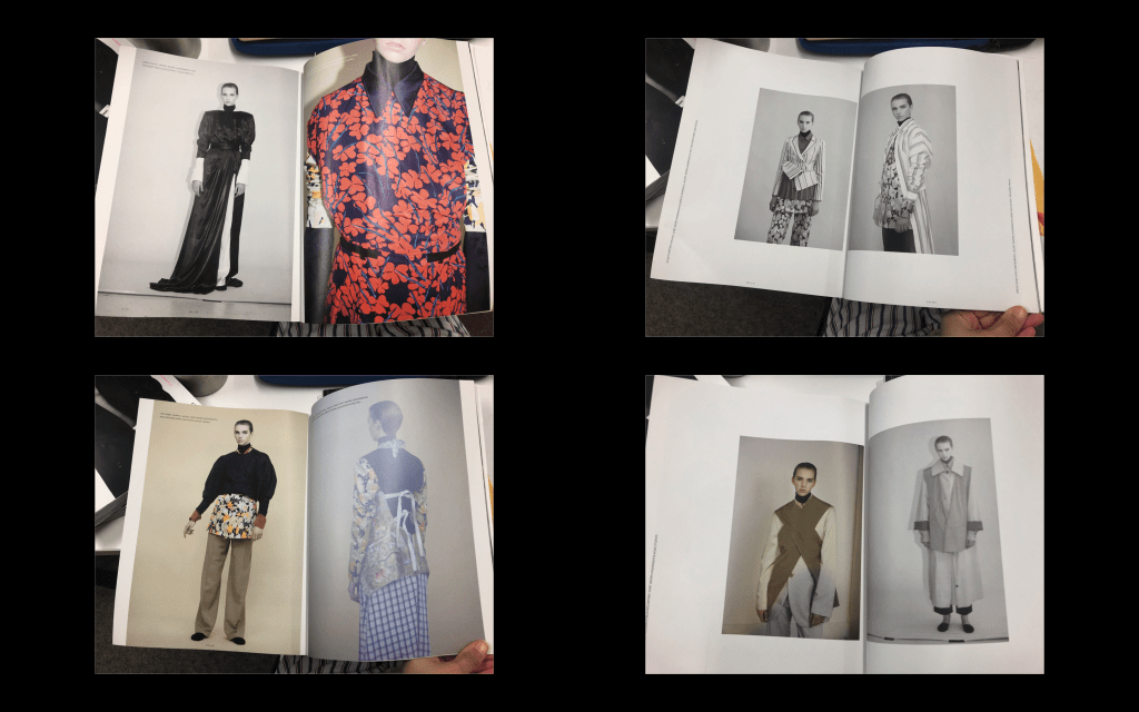
And the main task for the project is to create a 6-10 double page spread that includes place holder text and shoot credits as appropriate to the publication. As mentioned, I noticed that i-D alternates between single to multi images double page spreads and I’ve analysed one double page spread to give me an insight to what to include.