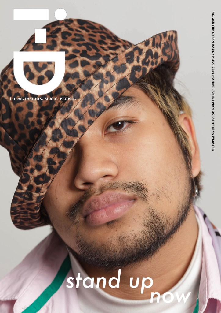
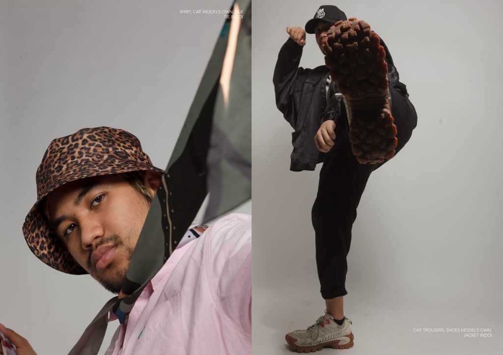
COVER
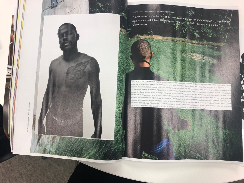
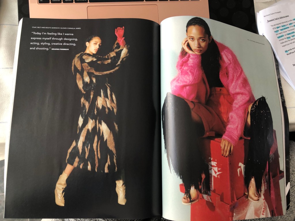
MAGAZINE DOUBLE PAGE SPREAD
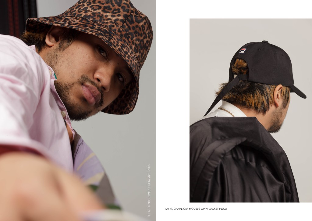
COVER
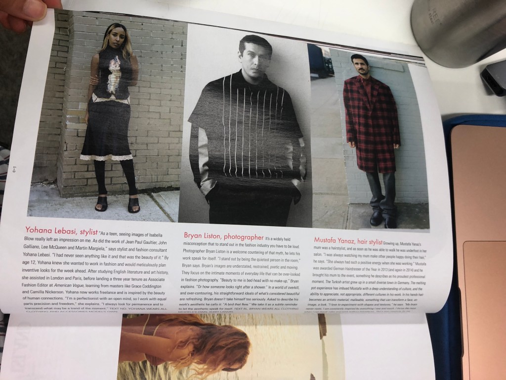
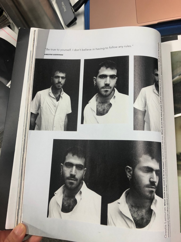
MAGAZINE DOUBLE PAGE SPREAD
Research (cont.)
After browsing through Mallika’s suggestions on what and who to research regarding my chosen topic, I’ve conducted even further research that’ll help finalise my idea.
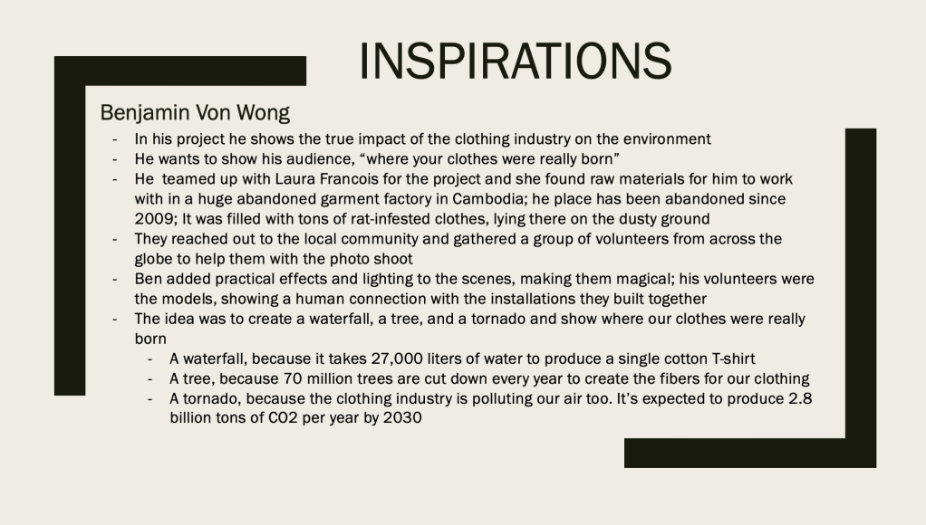
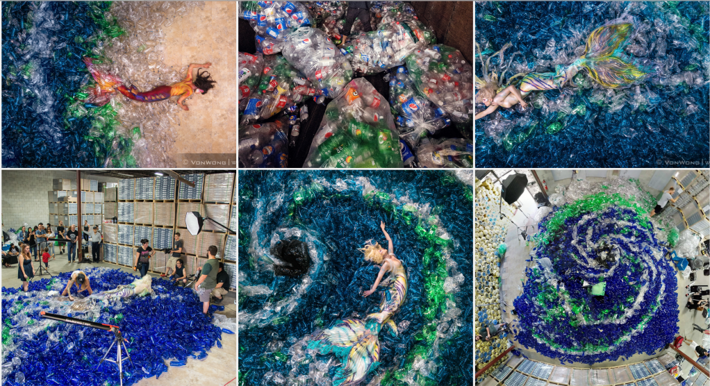
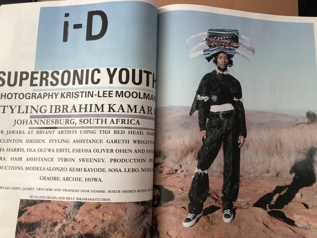
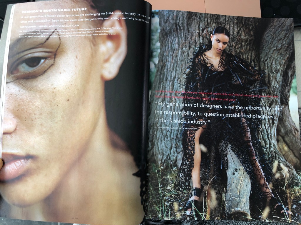
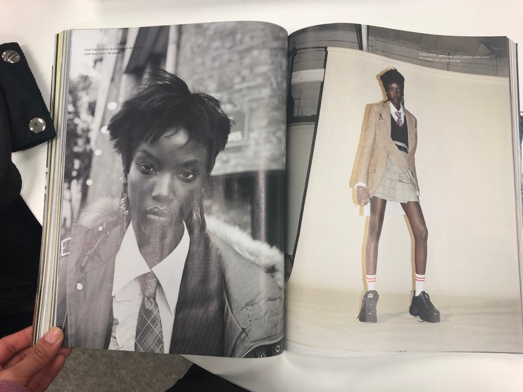
3. i-D (Fall 2018 Earthwise Issue)
Owning the i-D magazine issue relevant to my topic of choice definitely helped shape what I wanted to include in my magazine layout.
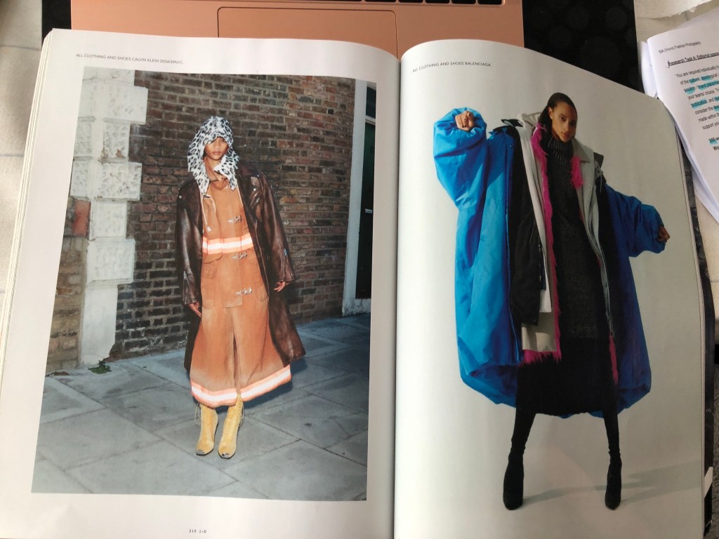
One of the main spreads I focused on is the one of model Adut Aketch modelling of Balenciaga’s campaign with the World Food Programme and Demna Gvasalia’s interview on how fashion is a tool that can help change the world. Gvasalia’s writes that the WFP actually helped him back when he was still living in Abkhazia, Georgia at the age of 12 in 1993 after the fall of the Soviet Union.
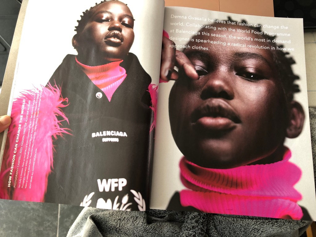
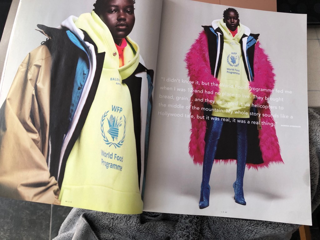
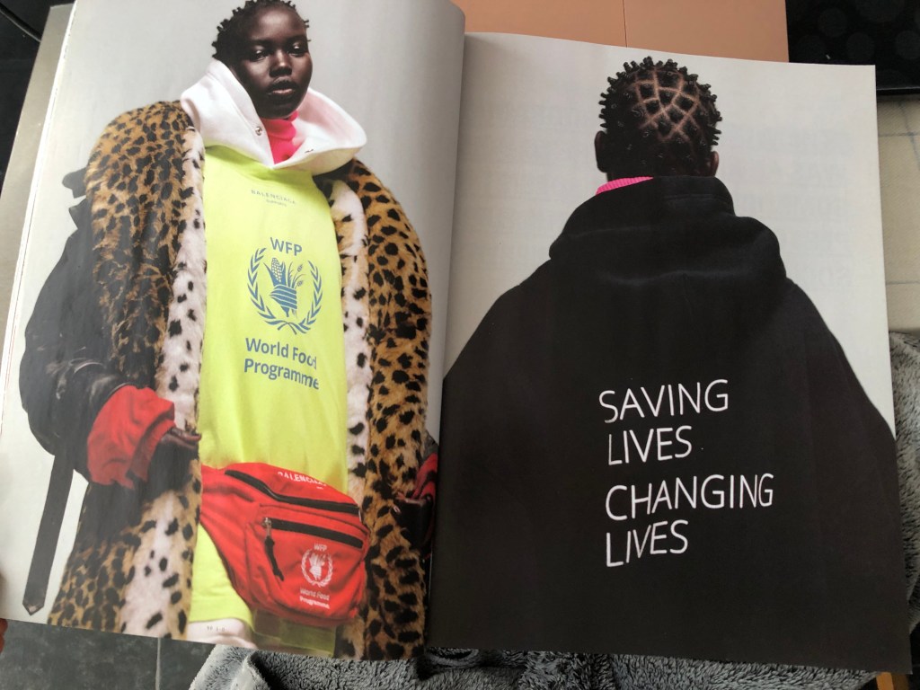
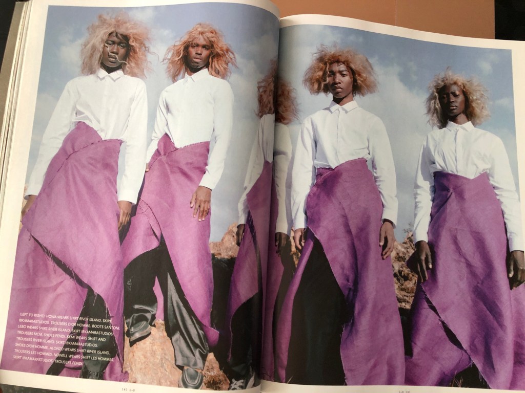
The reason for focusing on this particular spread is because of how simple yet powerful the message of fashion has through words written on the garments. I especially liked the fashion director’s (Alastair Mckimm) choice of styling the same clothes throughout the pages which is what I intend to apply on my own shoot.
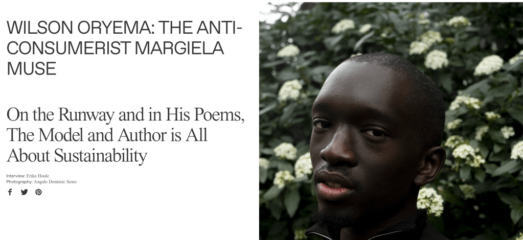
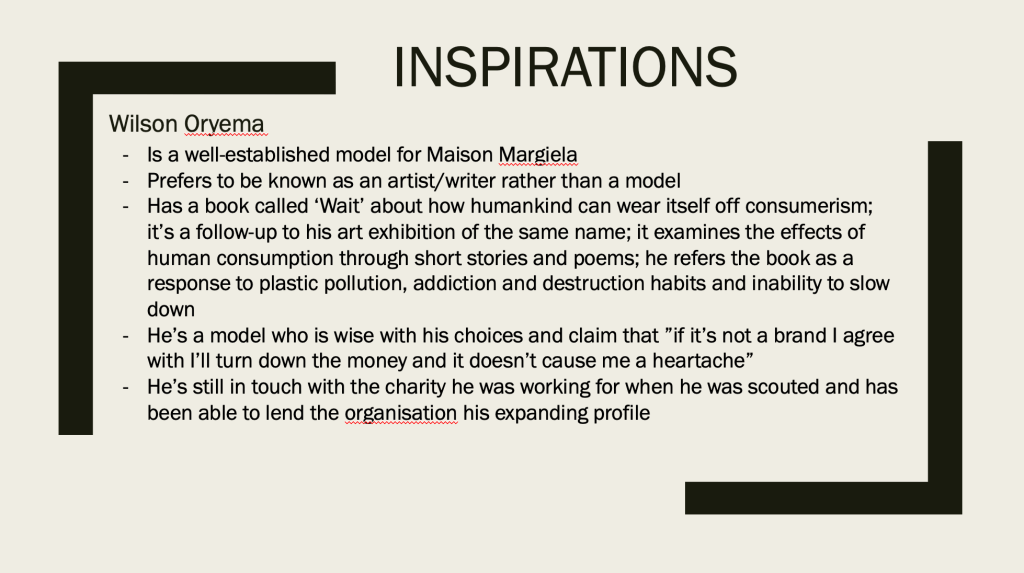
Research
For my shoot, I am tackling about sustainability in fashion, a topic prevalent in i-D’s ethos shown through their publication, website and social media. More specifically how slow fashion is the way to combat fashion being one of the biggest polluting sector contributing to changes in the climate.
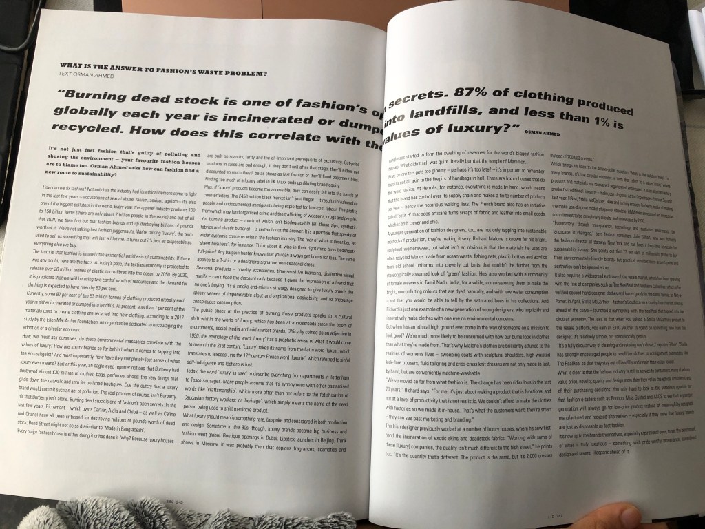
I’m mostly drawn to the topic after reading the book by British journalist and writer on environmental issues, Lucy Siegle’s “To Die For: Is Fashion Wearing Out the World?” The book provides a clear insight on how fashion is a polluting sector, examining the inhumane and environmentally devastating story behind the clothes we casually buy and wear.
After discussing this topic from our guest lecturer, Mallika, she’s suggested brands/ organisations/ people to look at allowing me to delve deeper into this sector.
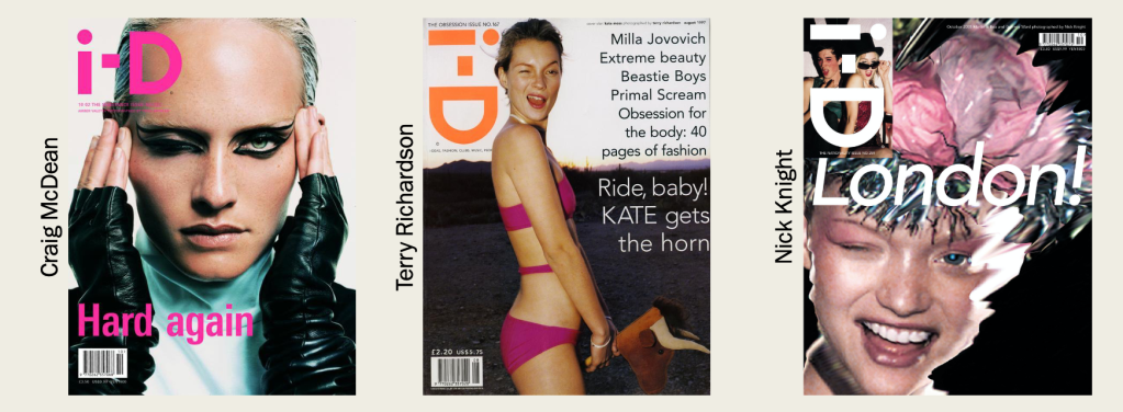
i-D is a British bimonthly magazine showcasing the latest fashion, music, art and youth culture. Launched in the 1980s by designer and former Vogue art director Terry Jones. I-D entered when punk area was taking London by storm and first published as a hand stapled fanzine. Since integrating with Vice Media, i-D is renowned for its ”vital voice in fashion and youth culture” and swiftly became the forefront of fashion and style turning into more of a contemporary style. The magazine is known for innovative photography, typography and representing fresh talent. Famous photographers Craig McDean, Terry Richardson and Nick Knight started their careers through i-D and still to this day continue to work with the publication.
Initially, i-D appealed to 15-24 year old females who love fashion, were of working class and capable of buying the magazine which was at £3.50 at the time. Nowadays, its audience are quite mixed, and it can be thought that through its simplicity and mature style, i-D attracts an older crowd but because of the creative imagery, art students both male and female are the primary consumers. With a circulation of approximately 70,000, the UK takes the lead with a circulation of 39,000 followed by Europe, USA and Australasia with a circulation of 33,000. It is understandable since i-D, aforementioned, is created in the UK.
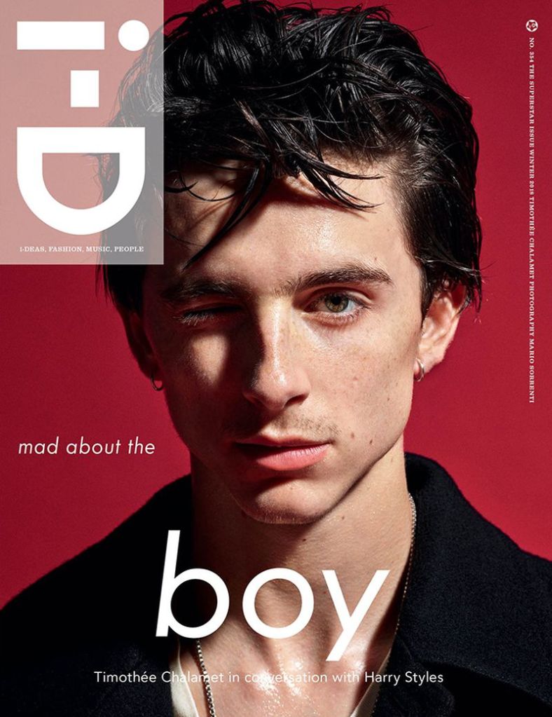
Compared to its previously abstract punk era, the layout of the magazine is generally minimal and relies on photographic imagery and pure creativeness. The front cover is never crowded with heaps of coverlines; instead it allows the cover artist to engage the audience through their appearance. Also, the typography often used is Sans which replicates the logo. For instance, in The Superstar Issue with Timothée Chalamet photographed by Mario Sorrenti, he is positioned in the centre of the page signifying importance to the reader. The tagline ‘mad about the boy’ is spilt, with ‘boy’ anchored below of Timothée allowing him to continuously overtake the cover. It is noted that the font size of ‘boy’ is larger than the rest of the text (other than the logo) to help emphasise him as well as referencing his new film at the time, Beautiful Boy. Interestingly, depending on the theme, the colour and style changes on each issue.
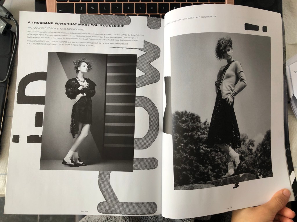
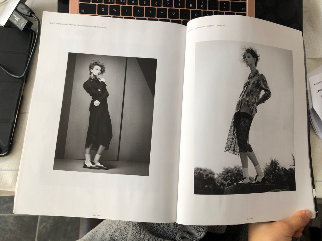
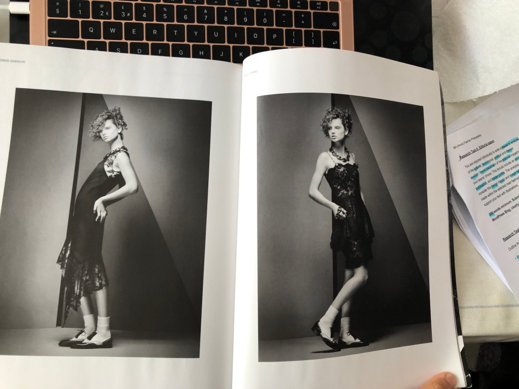
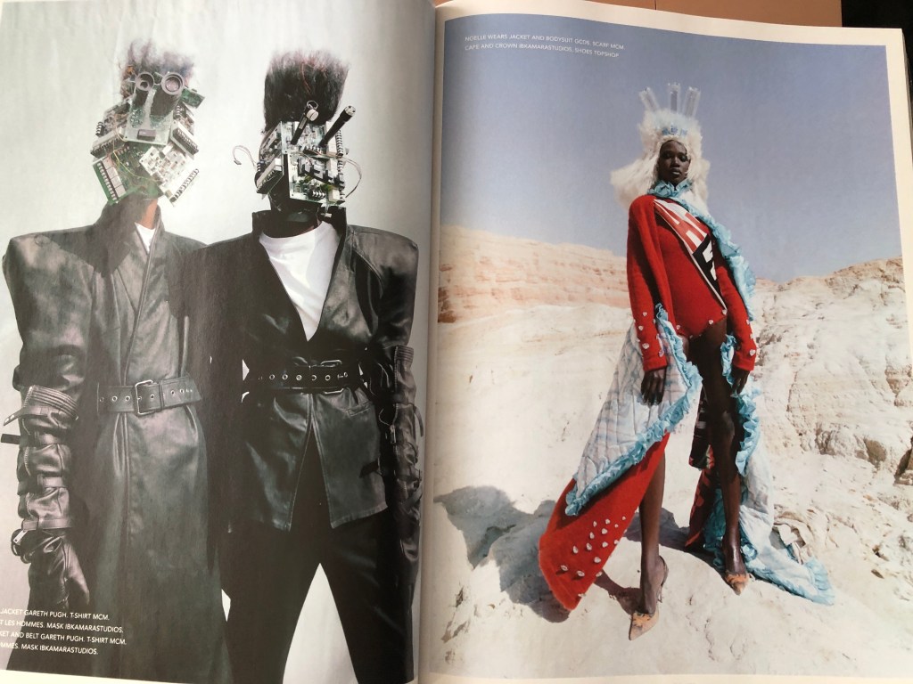
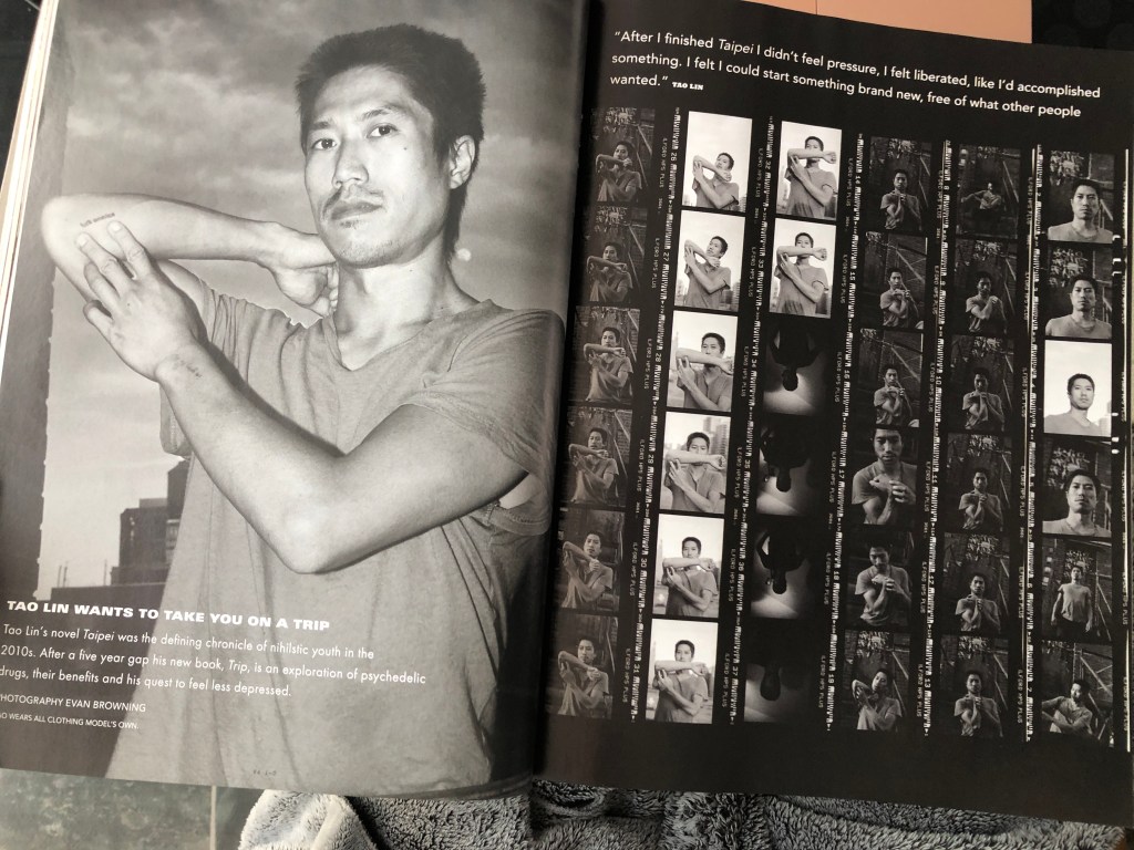
For my shoot, I am tackling about sustainability in fashion, a topic prevalent in i-D’s ethos shown through their publication, website and social media. And luckily, I own the ‘Earthwise’ issue published in Fall 2018 and my magazine is loosely inspired by this. Alongside this issue I focused my research on the recent (roughly 2010 onwards era) to base my magazine in because I felt that I connect more to their newer style compared to the punk era. In all(recent) issues I’ve looked at, i-D alternates each double page spread topic with collages or single image per page. Examples are shown below:
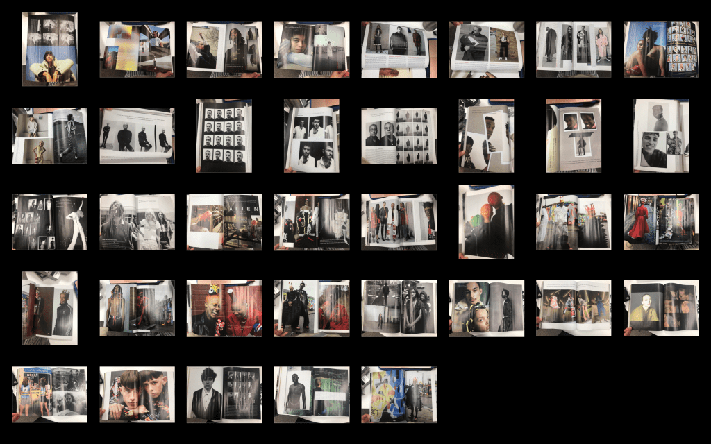
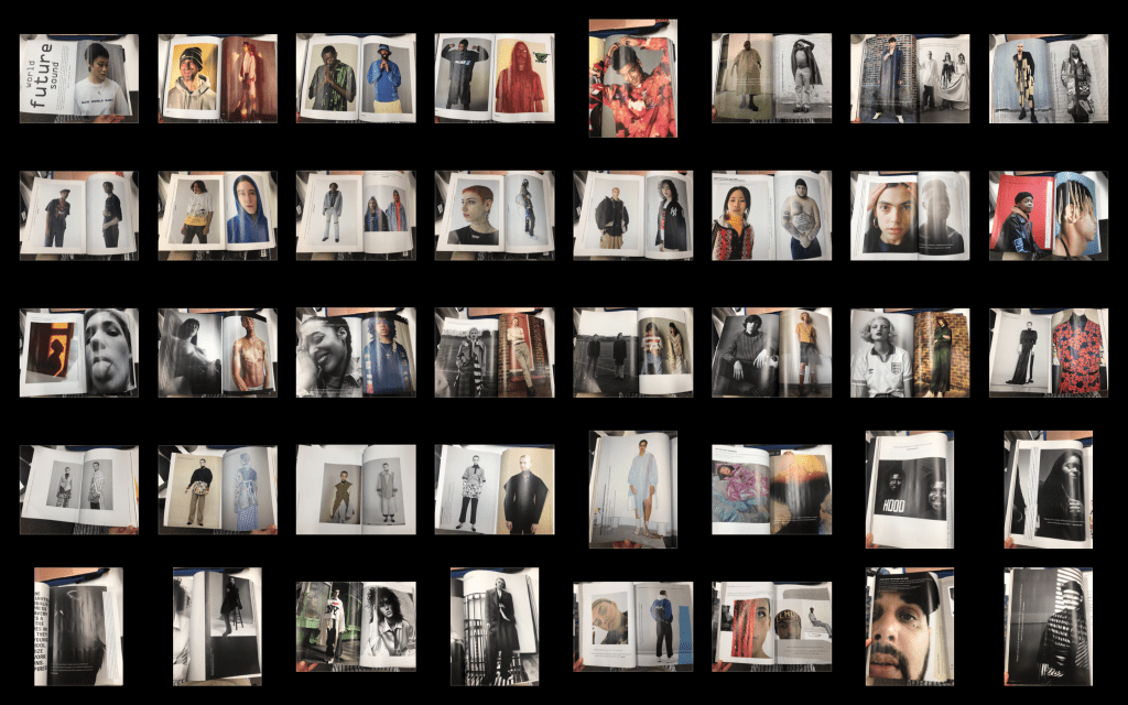
Single image per spread examples:
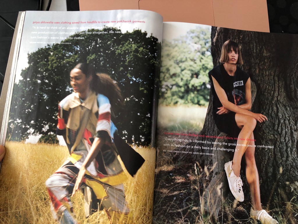
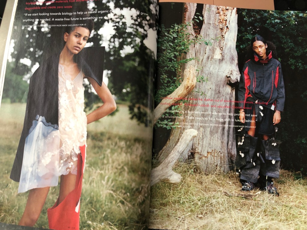
Collage/ multi-image per spread examples: