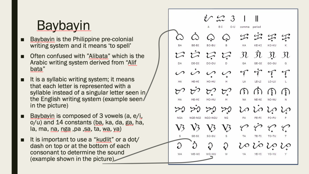
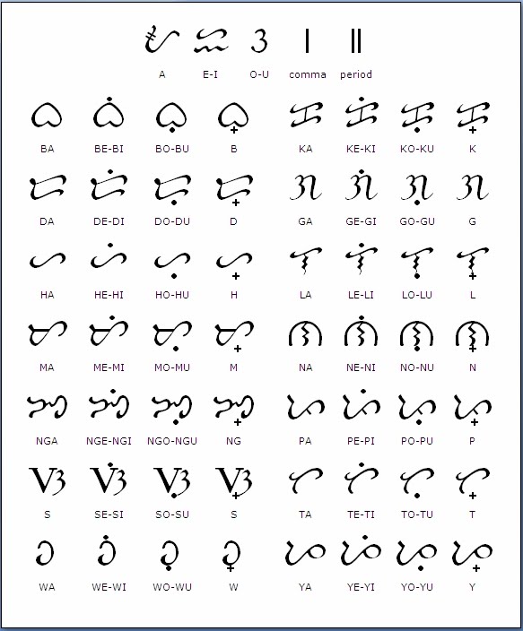
As mentioned on my previous post, I wanted to explore the pre-colonial writing system, baybayin.
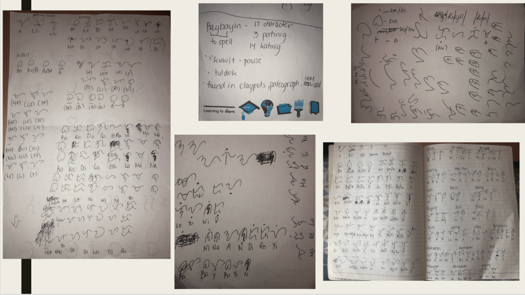
After learning the history of baybayin, I decide to take a step further and learn how to write it.
Being fluent in Tagalog, one of the official languages of the Philippines along with English, learning and understanding baybayin was not a challenge. Though being able to write the letters itself took a while to master as seen above.
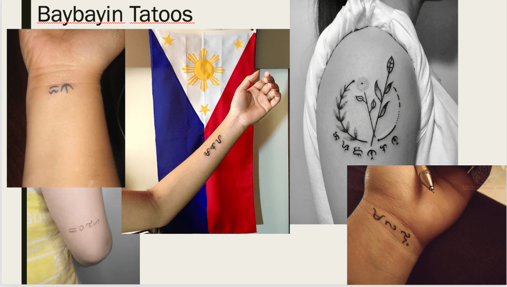
The reason for learning Baybayin is to represent and educate people about what Philippines was like during its pre-colonisation. I’ve looked at baybayin tattoos as I felt that this was the best way to include this throughout my series.
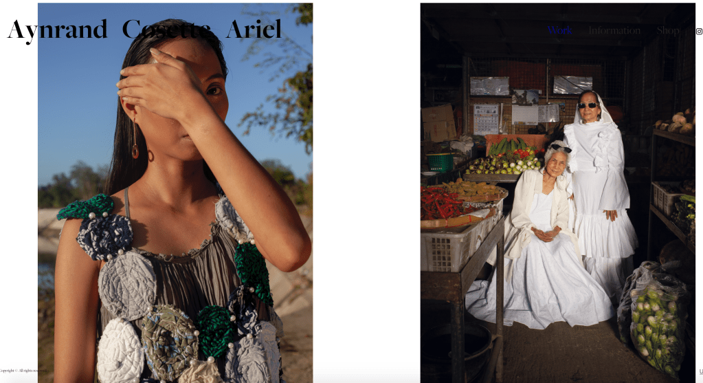
For this project, I chose to explore my Filipino heritage. I grew up in the Philippines up until 2013 when my older sister and I moved here in the UK to live with my mum, my little sister and (step) dad. I acknowledged that there has been numerous projects about our Filipino heritage such as last year’s graduate, Aynrand Ariel’s work, “Balikbayan”.
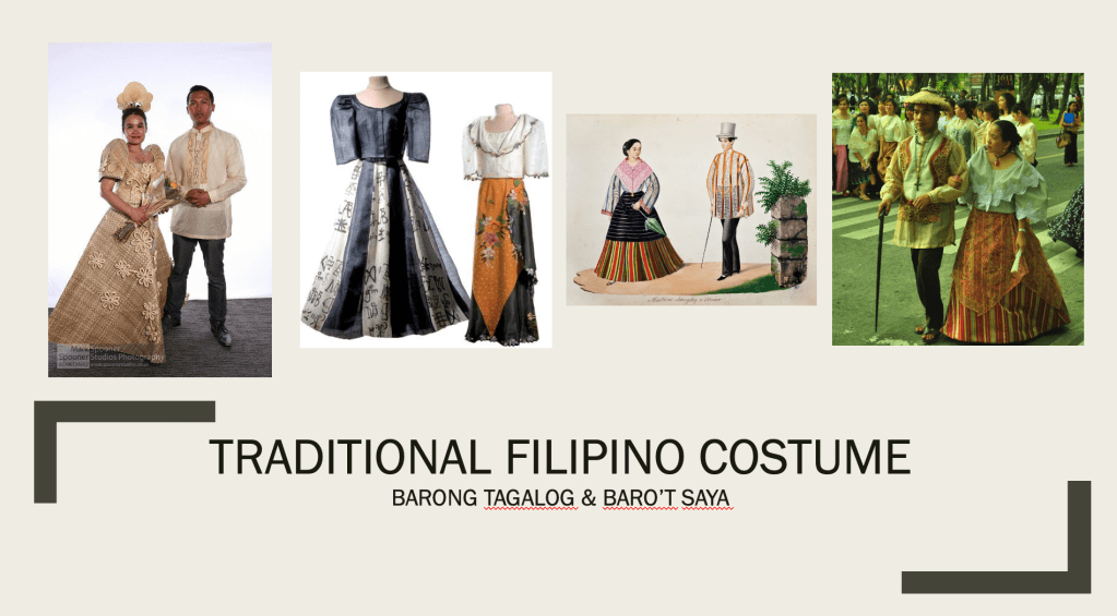
Therefore, for my project I wanted to explore and have a deeper understanding of the pre-colonial Philippines. This is through further expanding my knowledge on the national costume, baro’t saya or filipiniana, the pre-colonial writing system, Baybayin and incorporate the colours of the Philippine flag in my lighting setup.
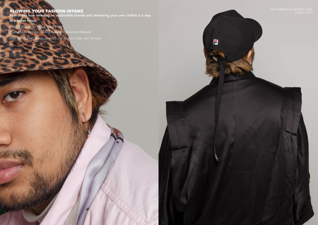
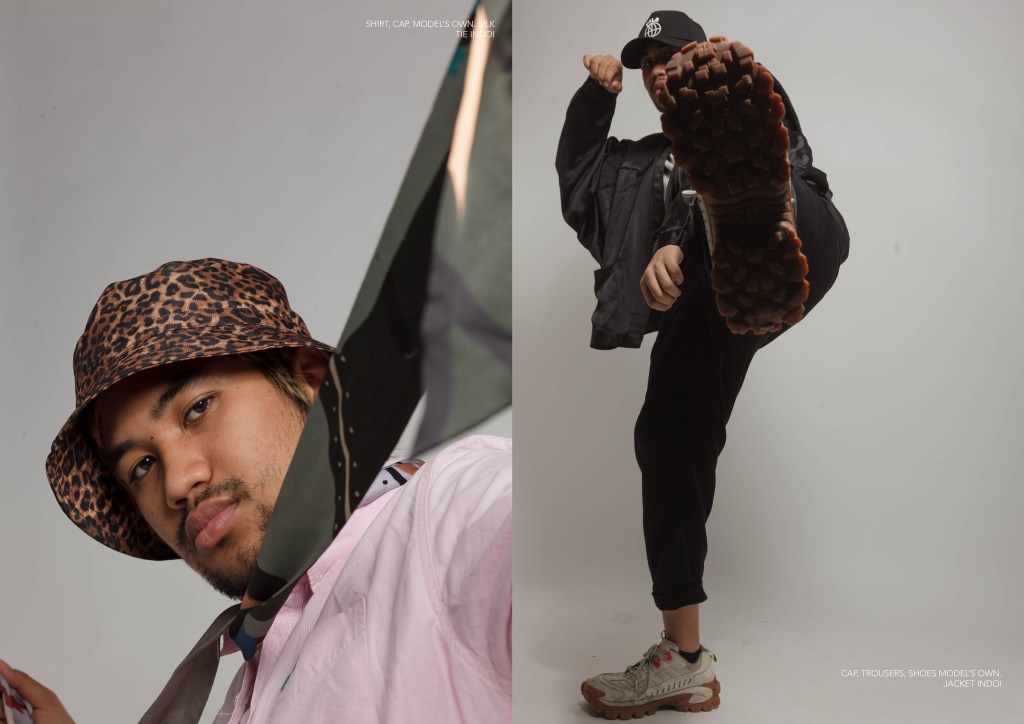
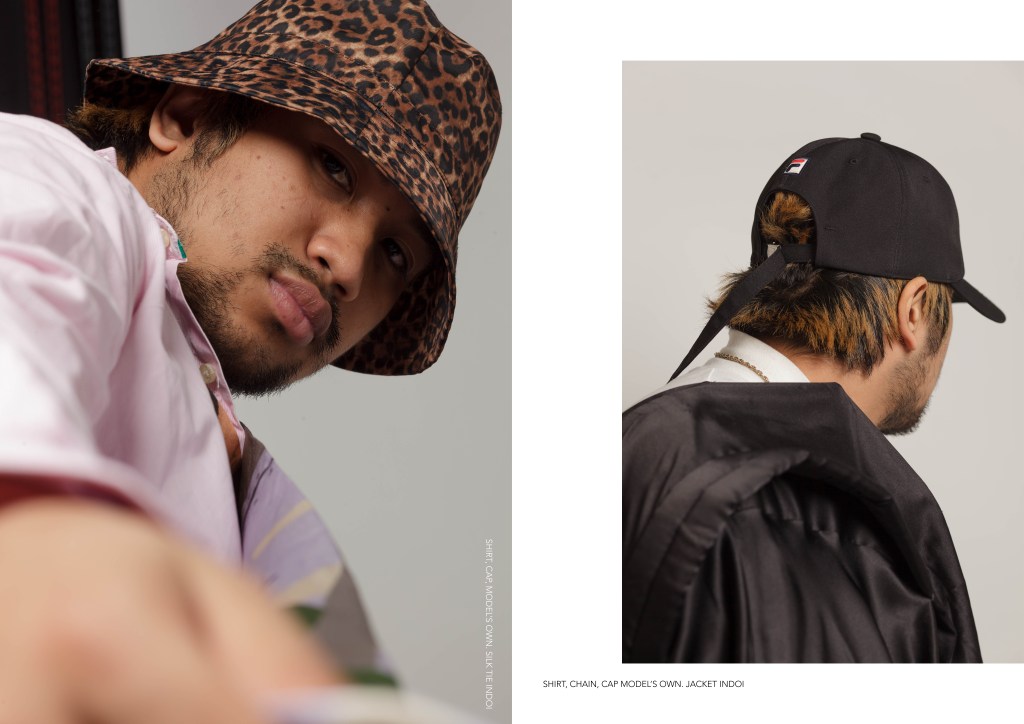
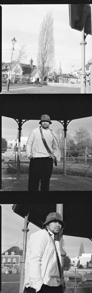
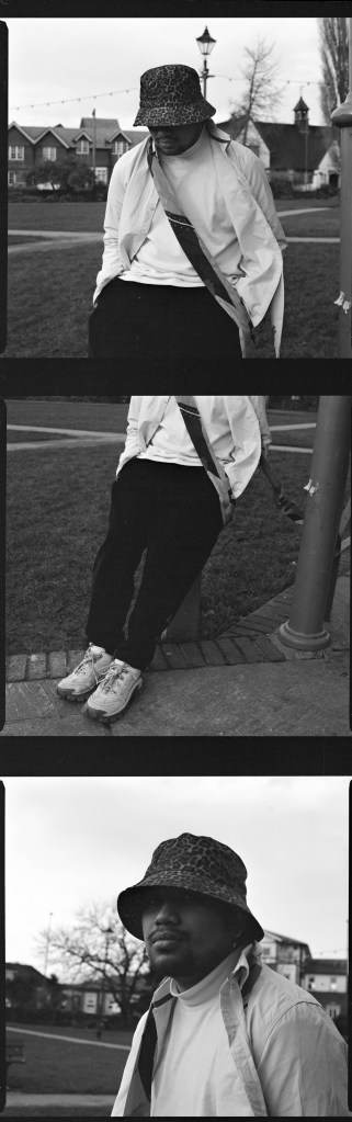
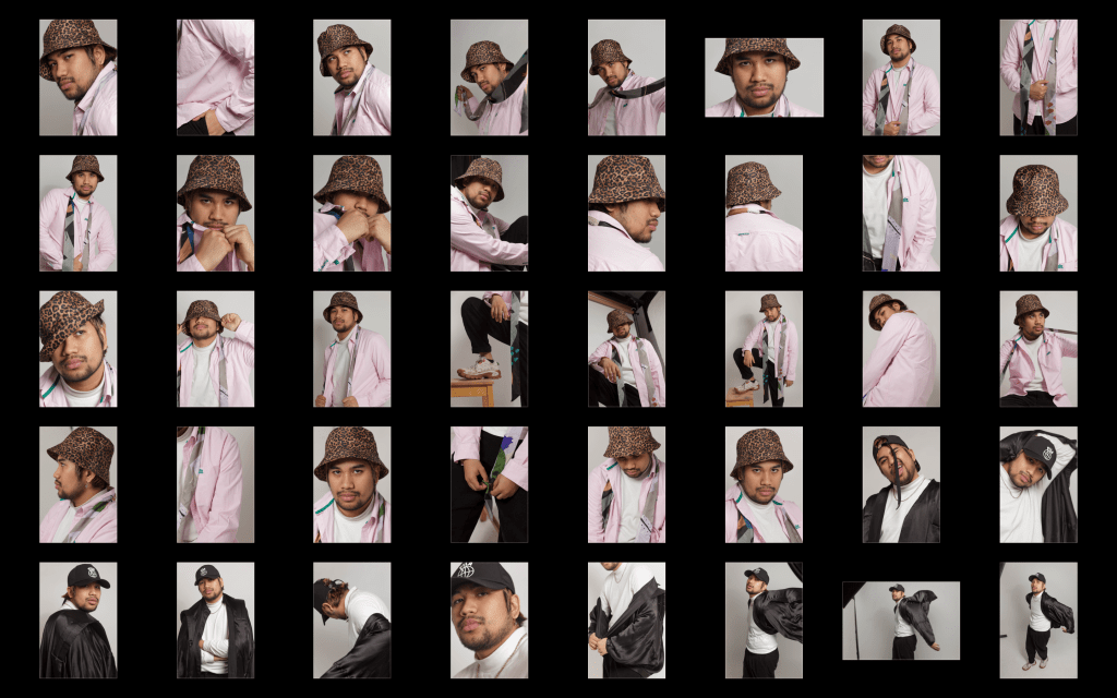
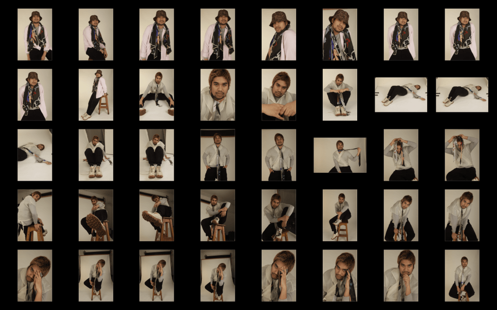
For my editorial shoot, my theme revolves around the sustainability behind fashion and more specifically how slow fashion is a step to a better future in the industry. As a fashion photography student, I felt that this topic should be tackled and show how you could possibly help combat the ever-polluting aspect of the fashion production through my medium. The way I portrayed this is by incorporating a sustainable brand, owned by our guest lecturer Mallika, and the idea of re-wearing your own clothes to show that you do not have to buy into the notion of trends put out by companies to make you follow the cyclical cycle of buying and throwing away your garments.
Reading the book by British journalist and writer on environmental issues Lucy Siegle’s “To Die For: Is Fashion Wearing Out the World?”, the book provided me with a clear insight on how fashion is a polluting sector, examining the inhumane and environmentally devastating story behind the clothes we casually buy and wear. To further expand my knowledge, I looked at sustainable brand Mother of Pearl, eco-conscious designers and notable people, Wilson Oryema, Patrick McDowell and Kaan Amjad as well as organisation Fashion Revolution, founded to voice out the problems of the industry.
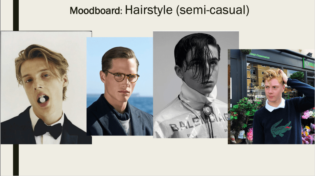
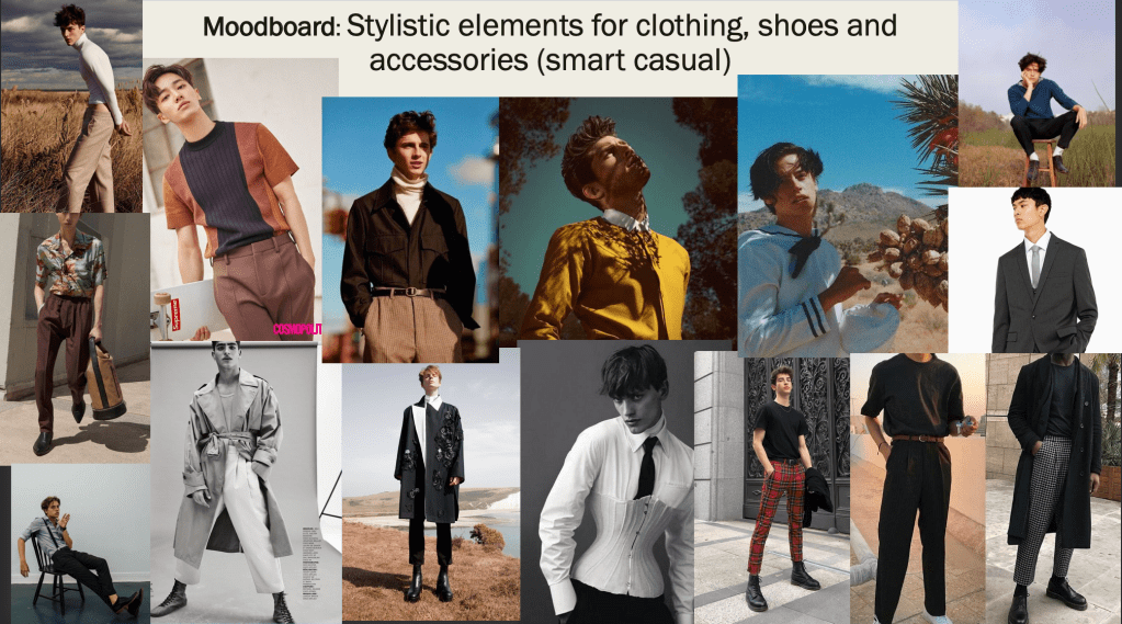
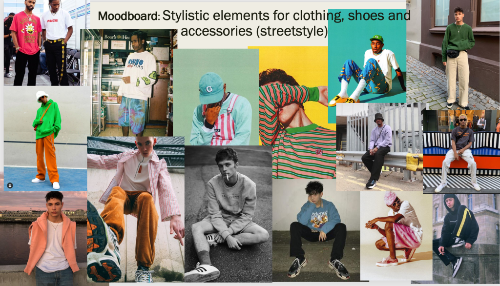
Initially I was going to do two styles which are streetwear and smart casual to show that no matter what style you may have you can still find a way to satisfy your taste if you slower your fashion intake. However, my model who would essentially do the smart casual shoot cancelled a few times leading me to only do the streetwear shoot which in turn allowed me to focus and develop the idea even better.
Moodboards I created for the smart casual shoot
Another reason the test shoot did not go well that I did not mention is that, prior to not getting an extension on the project, I was unsure about the composition at the start of the shoot and only got the hang of it by the last outfit. In turn, gave me the chance to review and pinpoint what I could improve for the final shoot.
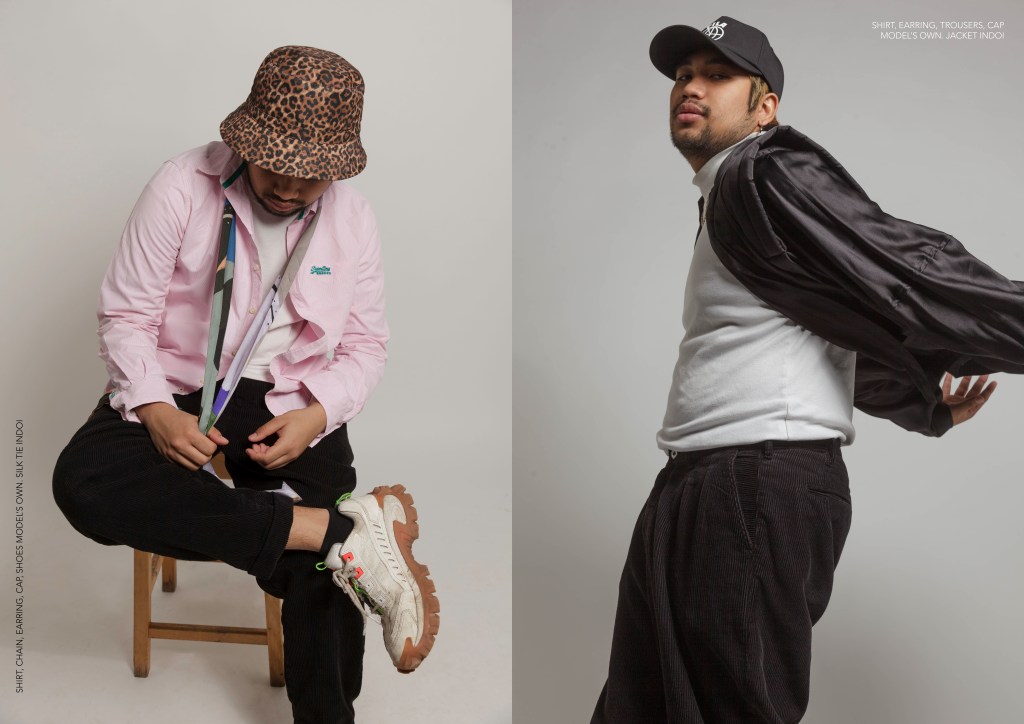
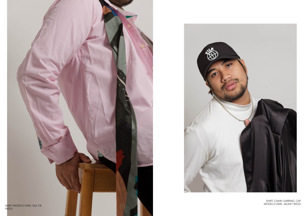
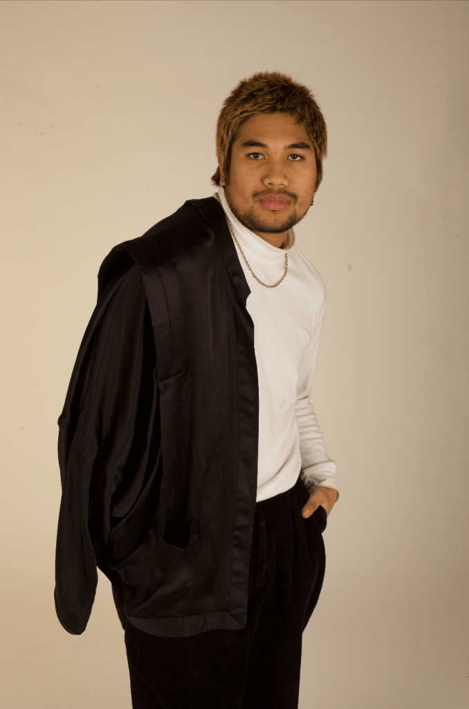
In both shoots, I styled the model in 3 outfits, the second of which I did not like until I browsed through the photos. I felt it leaned more towards the smart casual look so in the end I only used the first and third outfits to which I’m contented with.
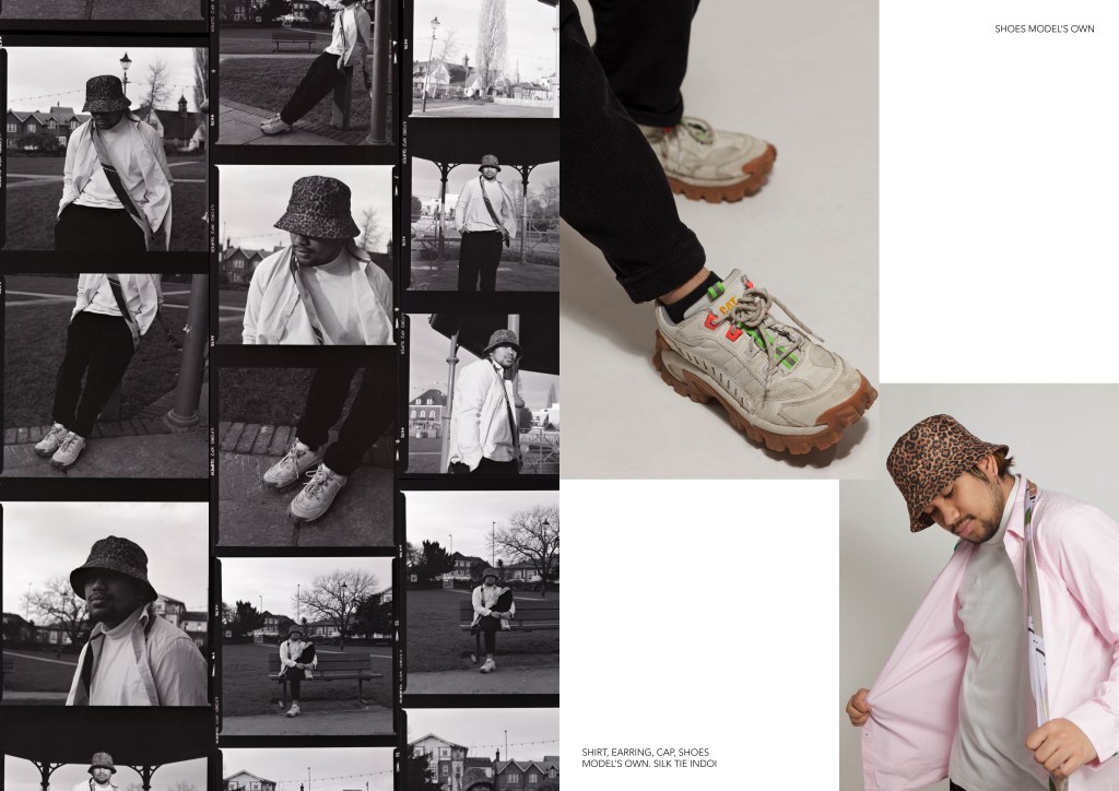
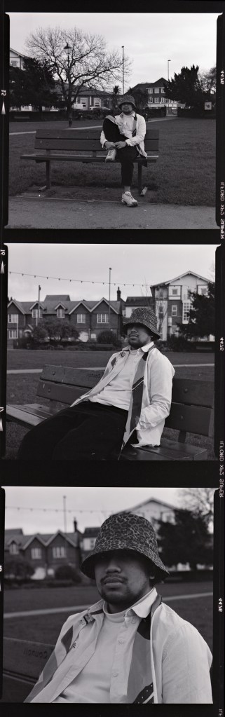
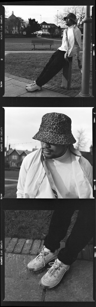
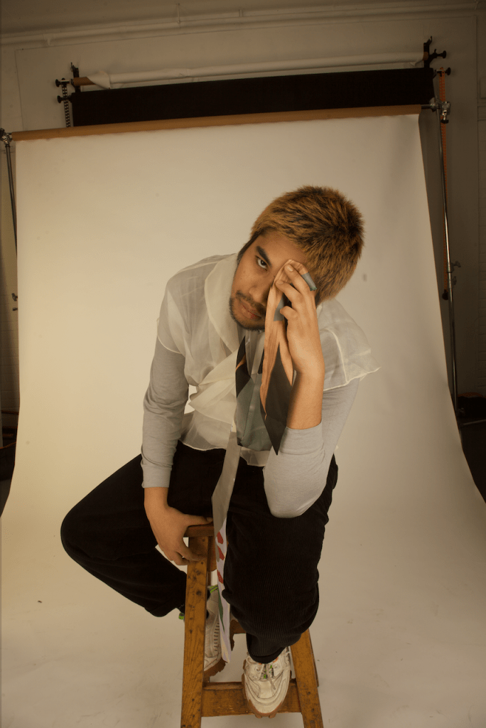
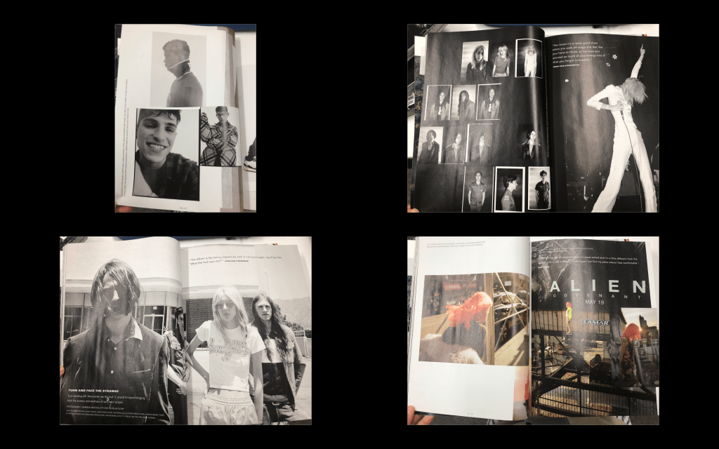
My styling and photography assistant took loads of behind-the-scenes of the shoot on film, however, on the day of developing I accidentally dropped the exposed film on the floor of the processing room to which I was not able to recover. I therefore lost my behind-the-scenes images I intended to upload here. It is safe to say I’ve learned to be careful in the darkroom.
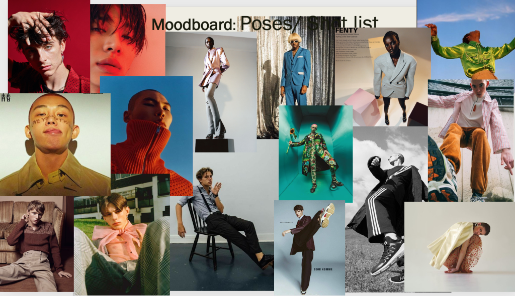
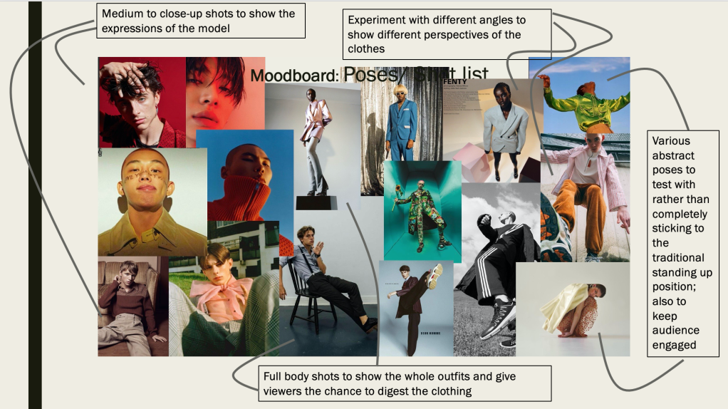
Prior to joining the course, I mostly shot close-up portraits and full body shots were more outside of my comfort zone. Nonetheless, I took the chance to experiment alternating between full and mid shots and I was contented with the outcome and would definitely keep testing out various shots.
Overall, I found that my final shoot is what I envisioned and certainly touched on the topic of sustainability in fashion wholly and gave an insight on how to help build a better future.
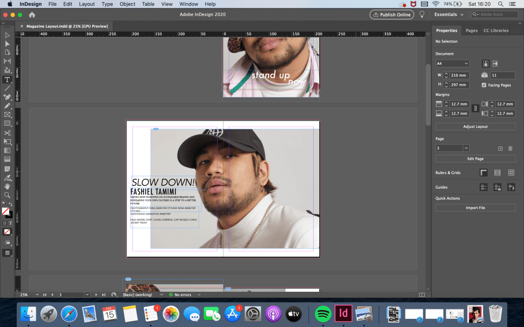
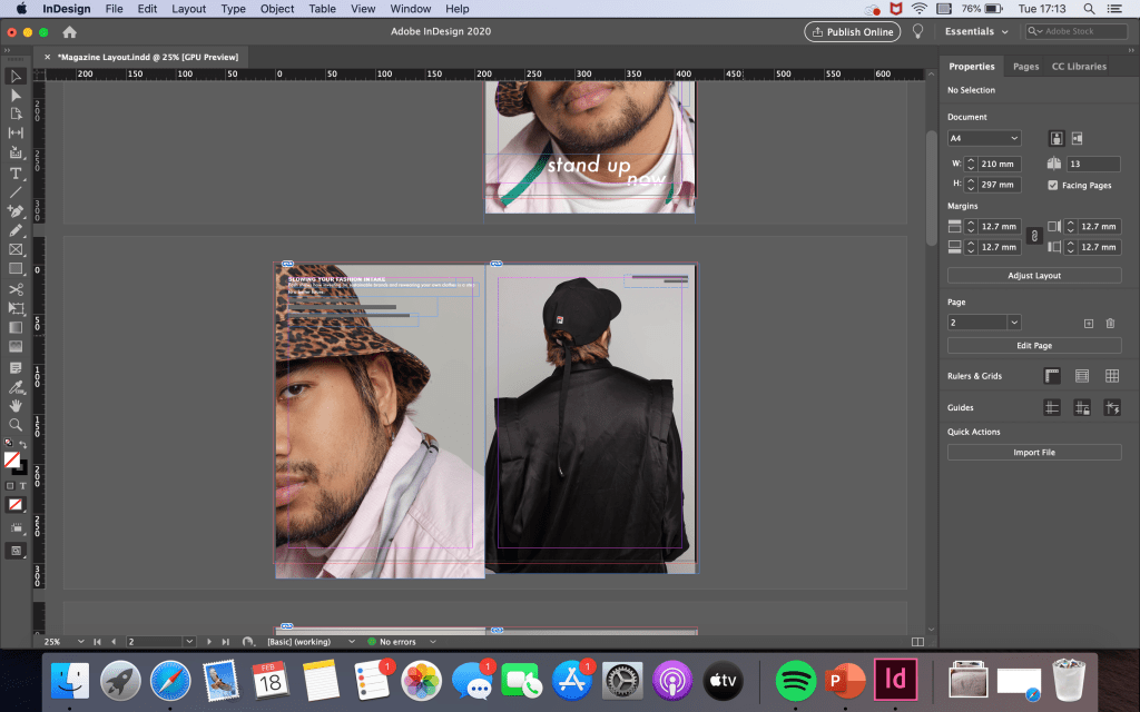
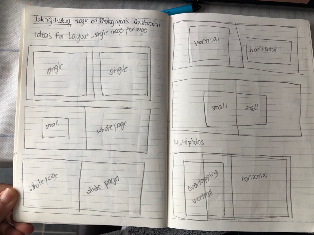
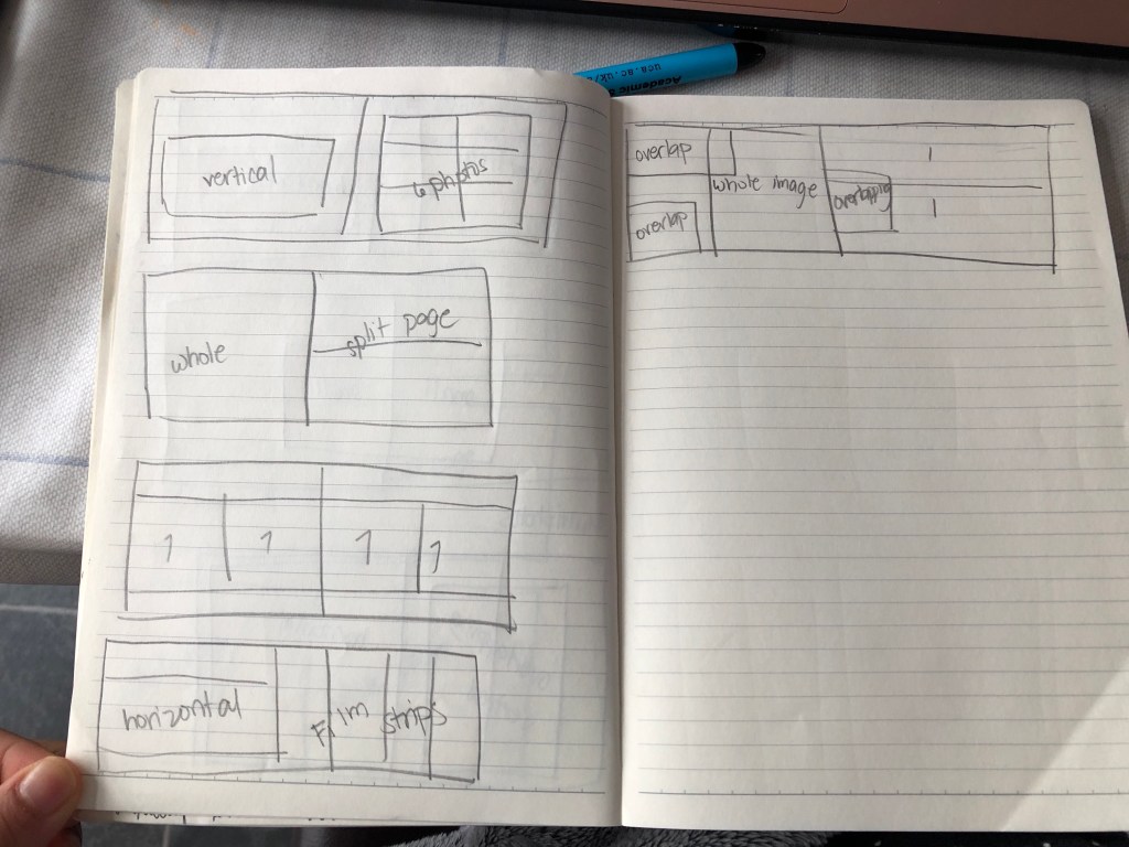
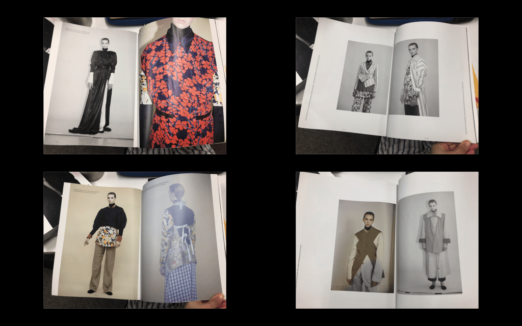
For the layout I decided to go for the single image per page with the exemption of the film photos (below) that I’ll edit to serve as contact sheets.
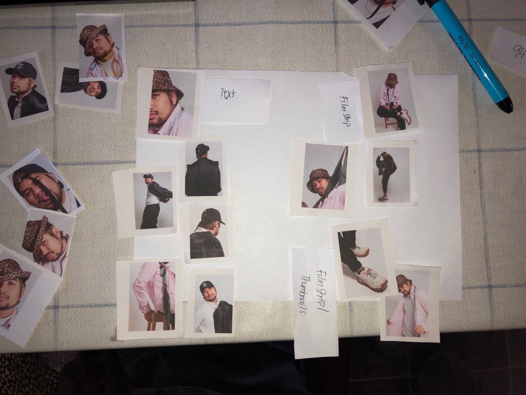
To help me have a better understanding on which pictures to use for my magazine layout I printed out the final edited jpegs into thumbnails as I find it easier to have a physical copy of the images and move them around freely if I ever change my mind.
Indesign was a software I didn’t have any prior knowledge with. I was unable to attend the first workshop on the software and the second session didn’t go well due to the internet going down on the day. Therefore, I scoured through myUCA and found a helpful step-by-step on how to use it.
Below are some screenshots during the editing process.
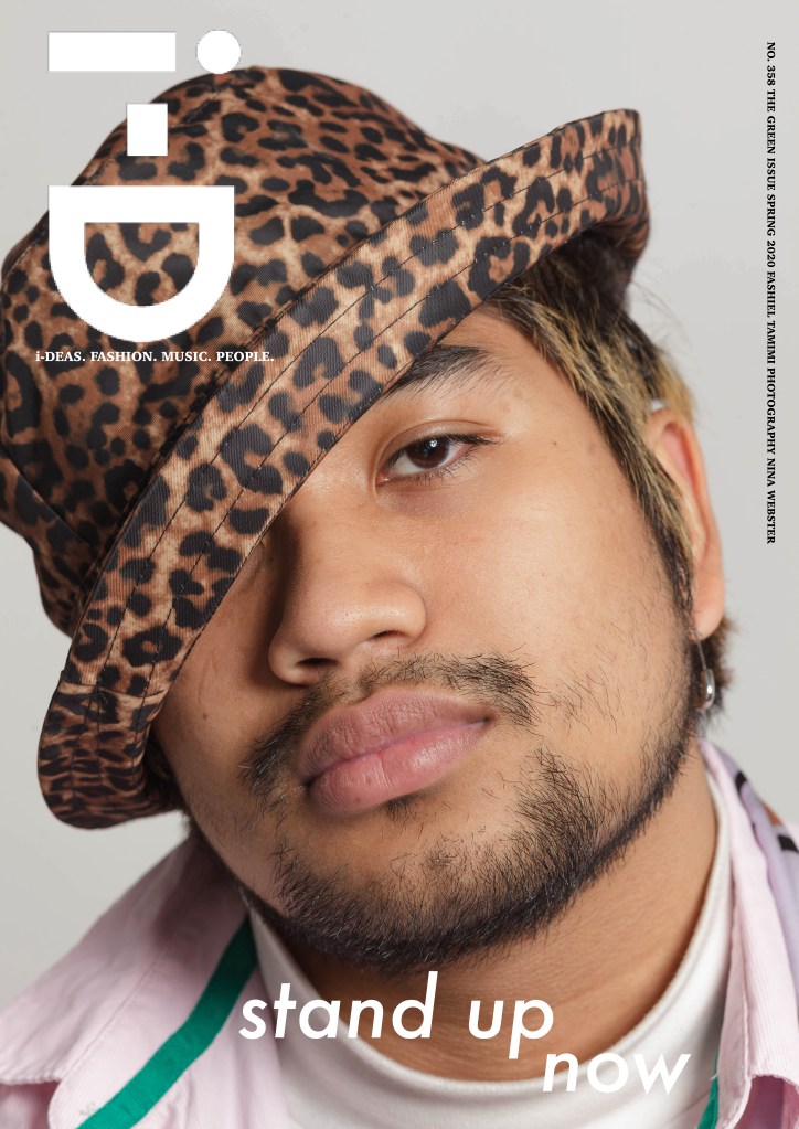
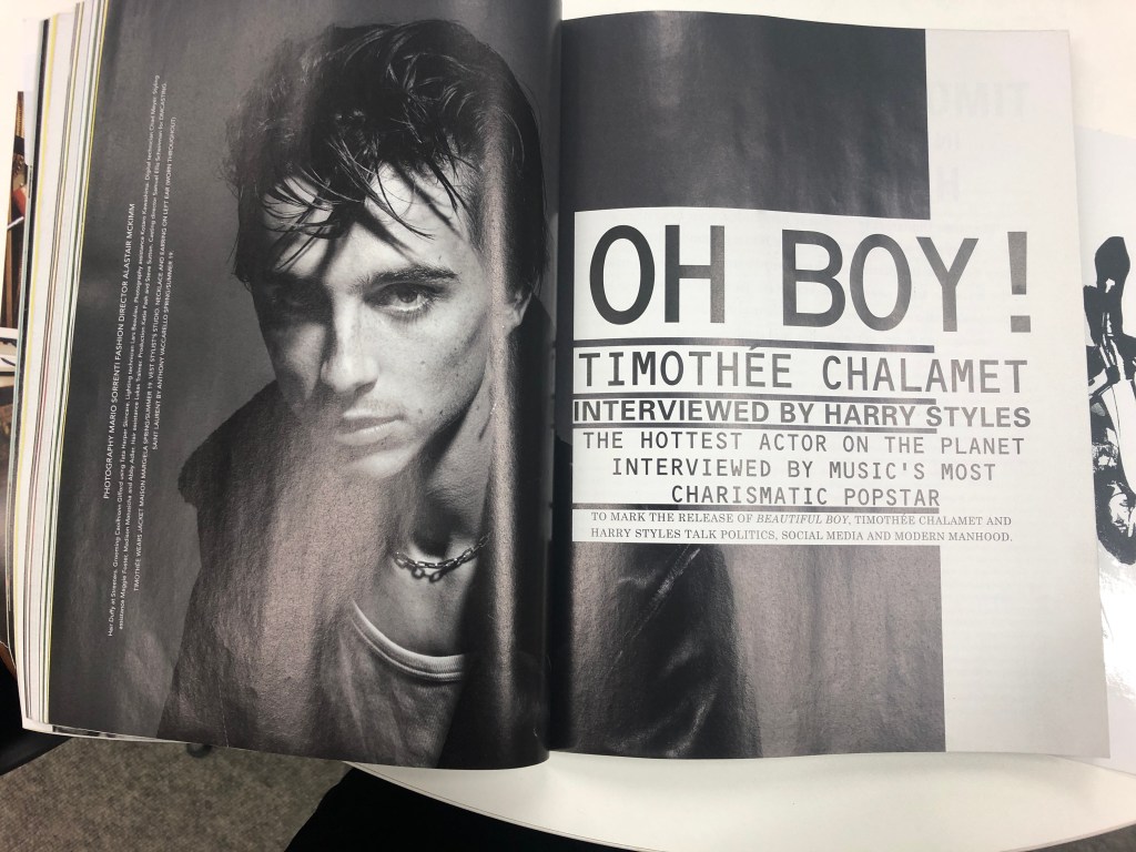
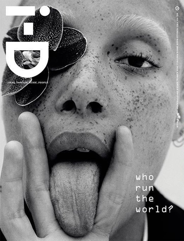
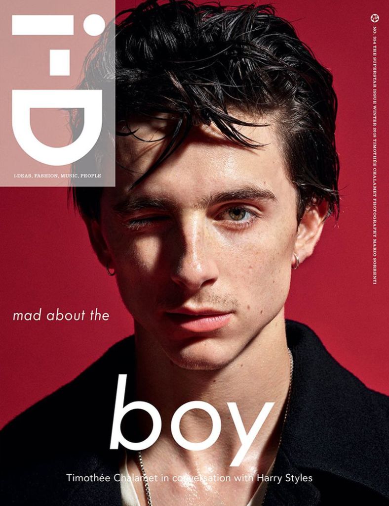
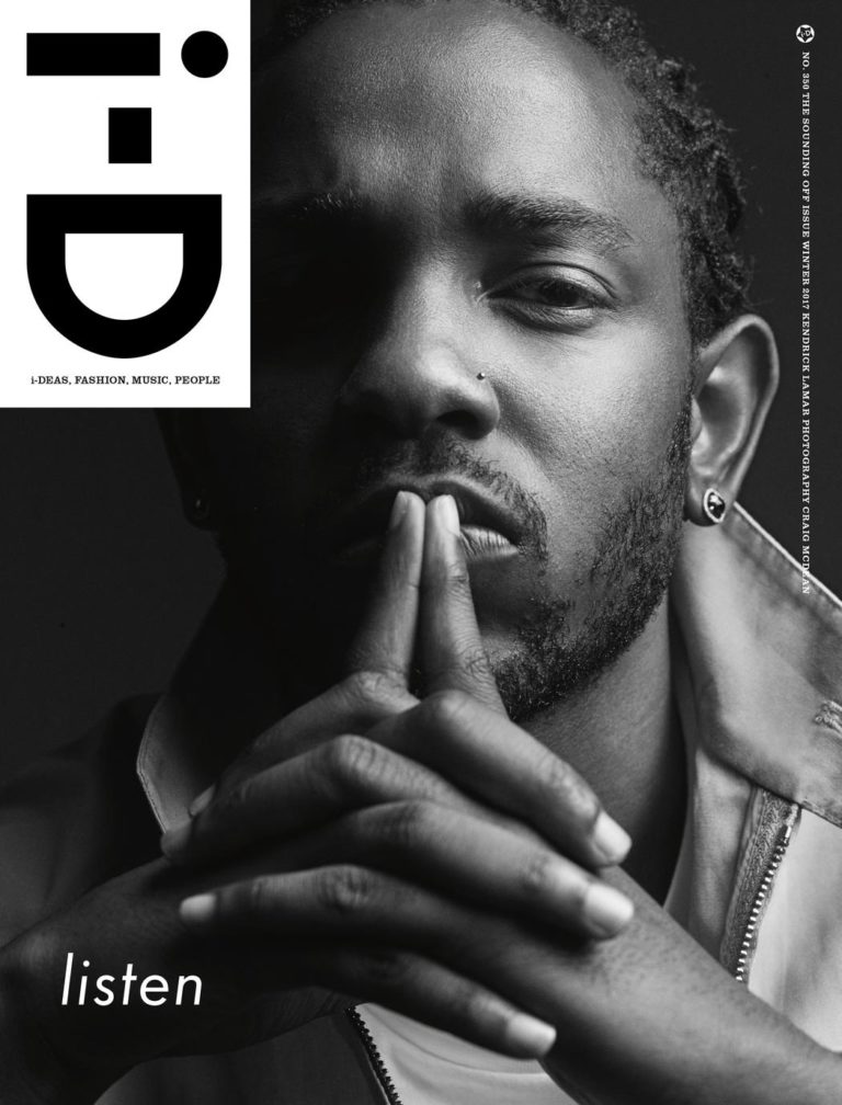
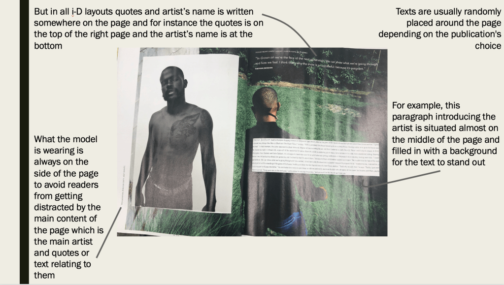
I wanted my magazine layout to sort of replicate the Winter 2018 i-D cover with Timothee Chalamet as to me it stood out the most through its bold typography, layout and imagery.
Wanting it to resemble the aforementioned magazine spread, I felt that it didn’t work because it felt too forced or rather I’m plagiarising Mario Sorrenti (photographer) and Alastair McKimm’s (fashion director) artistic choice.
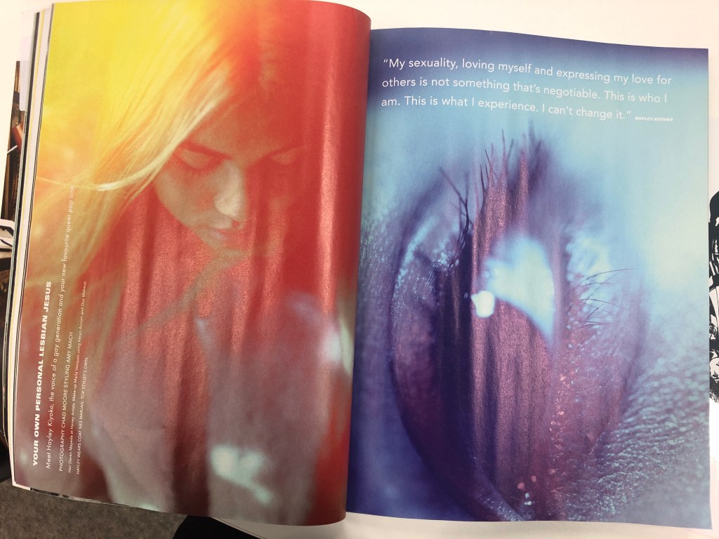
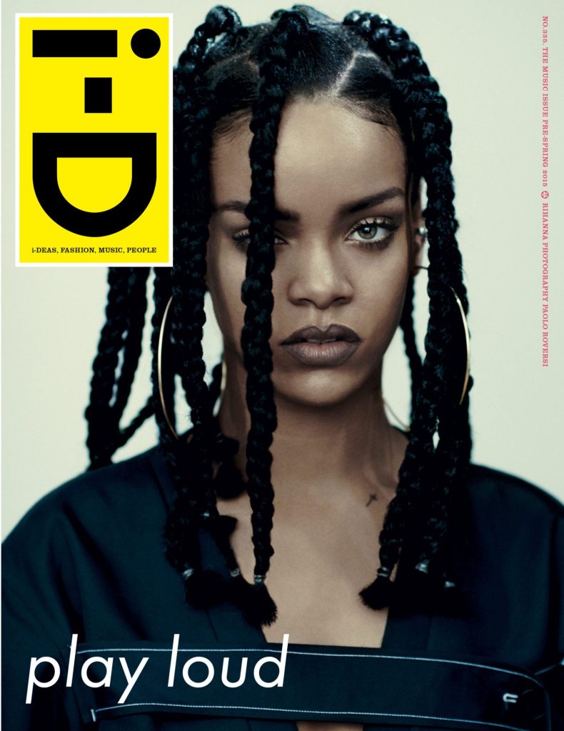
Therefore, I referred back to my printed layout guide to experiment with my own spread and opted for the simple and subtle route like Hayley Kiyoko’s spread below.
Previously, I mentioned that my initial shoot did not work out and I’ve researched and learned how to create a better solution for my final shoot.
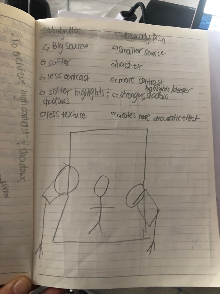
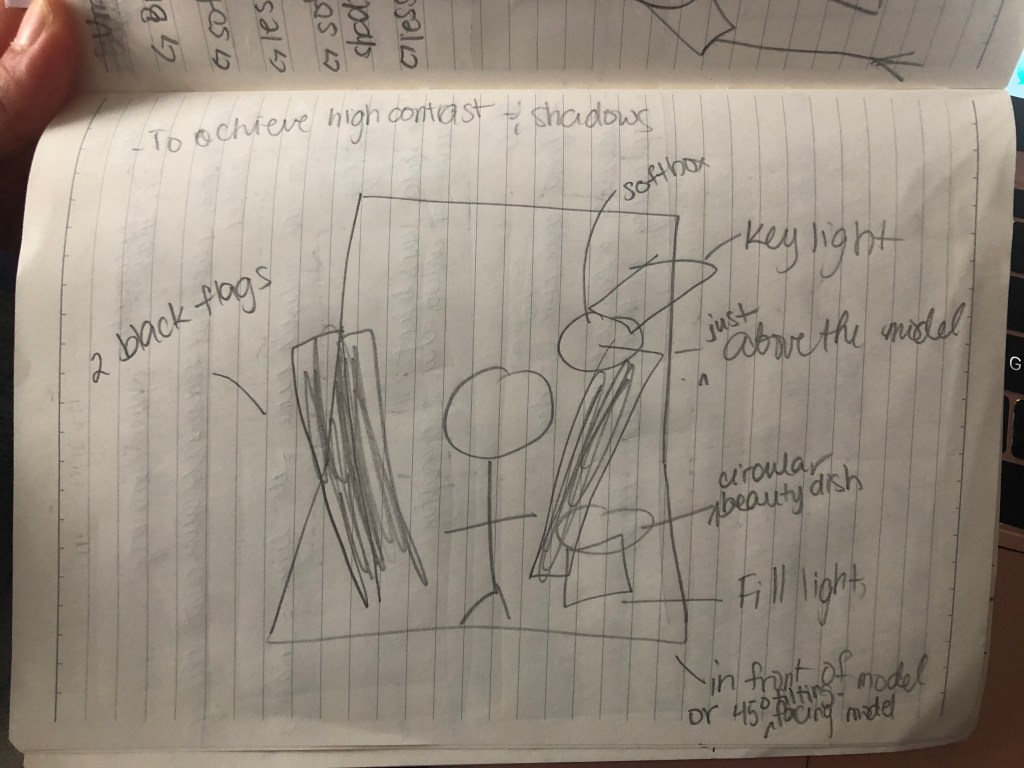
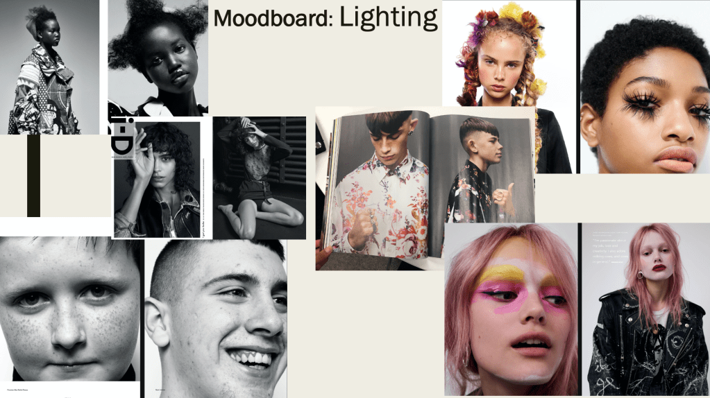
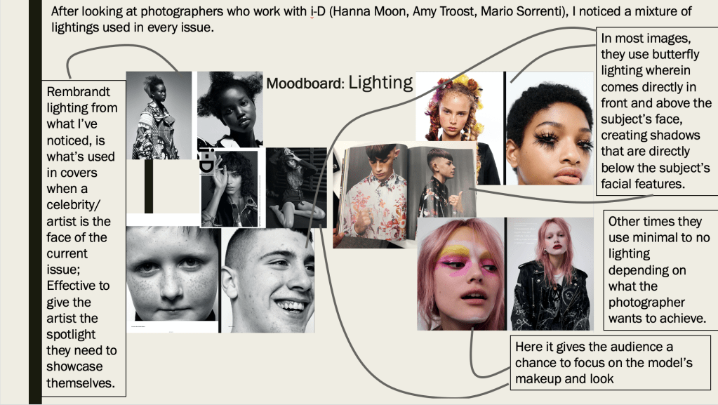
After watching a few YouTube videos, I (badly) drew a lighting setup guide to help myself achieve the minimal shadow lighting I want shown in a some i-D magazine covers.
Through the tutorials, I learned to either use a beauty dish or an umbrella to achieve the look I’m going for. However, I thought of combining the two, having the beauty dish slightly in a 45 degree angle above the model as the key light and the umbrella to act as the fill light also in a 45 degree angle on the right hand side of the model as well as two white flags on either side to bounce back the lights creating a less to no shadows while playing with the intensity as well.
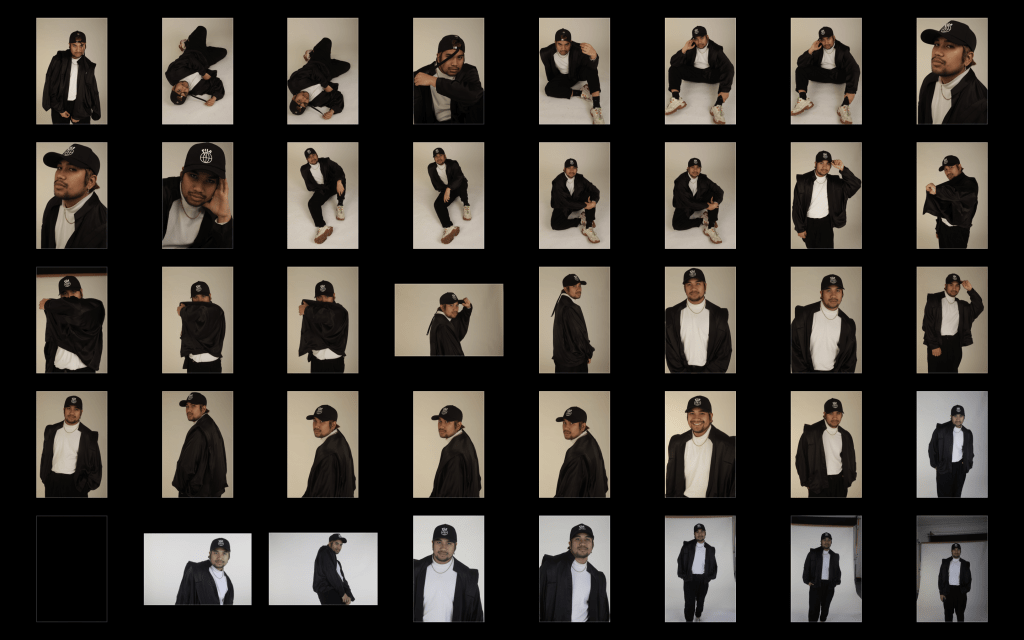
Below are edited batch results from my final shoot which I was pleased with.
Initially this was meant to be my only shoot for the project, however, I wasn’t pleased with the outcome of the lighting. As mentioned, I wanted the lighting setup to either be rembrandt or quite high key with minimal to no shadows. Although the outcome resulted to minimal shadows, it gave my pictures a yellow cast no matter how much I increased the intensity if the light. Also, I didn’t like how the ceiling was too low making it not possible to heighten the position of the lights.
Below is a closer look of examples from the shoot:
I had no choice but to ask my model if I could reschedule another shoot and I decided to do it outside of the university since the studio (1) was not available the day my model was free and Rochester is quite far and expensive for him to come back again.
After this mishap, I watched tutorials on how to achieve a lighting setup using one or two light sources to give me a clearer idea on how to set it up next time.
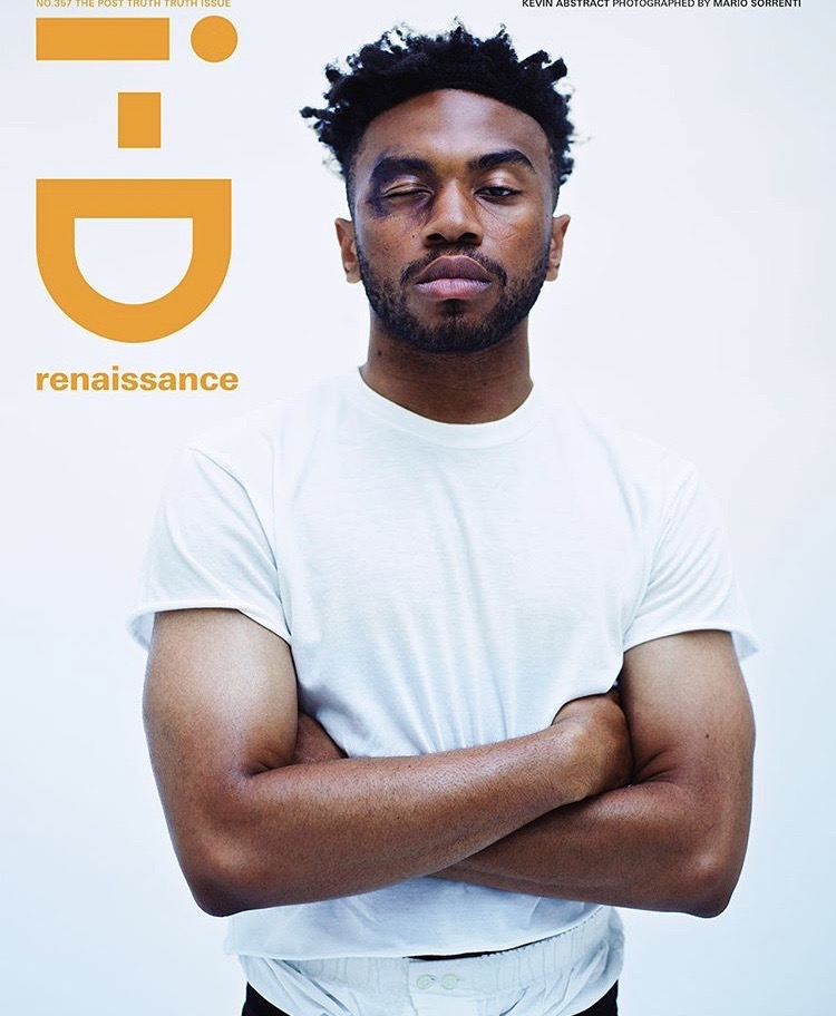
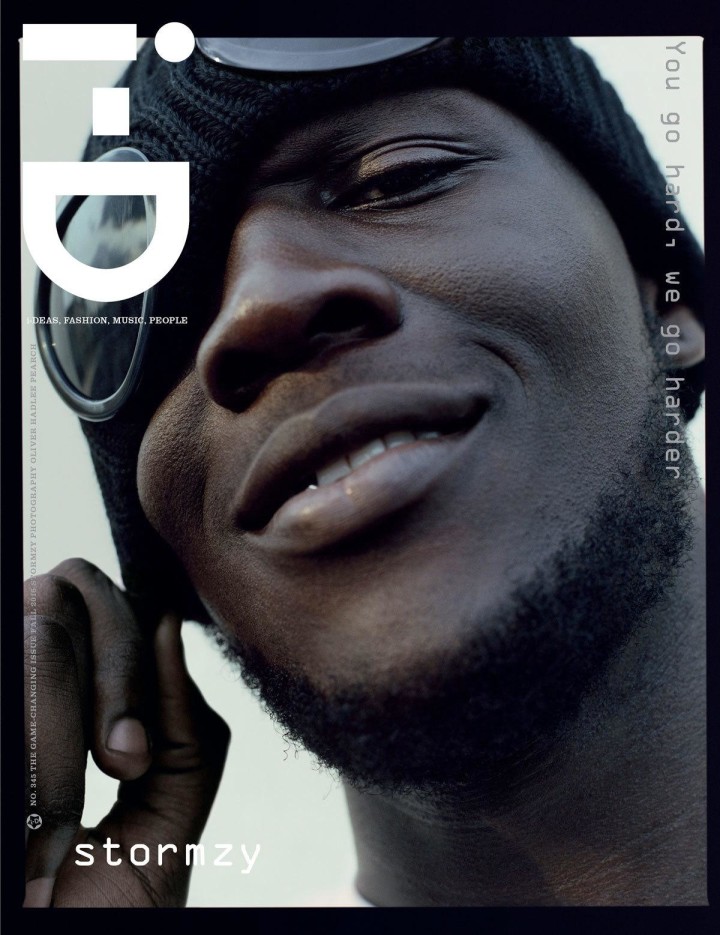
As mentioned on my previous post, I chose i-D as my magazine publication. And with this I’ve browsed through recent issue to base my own magazine on.
Covers
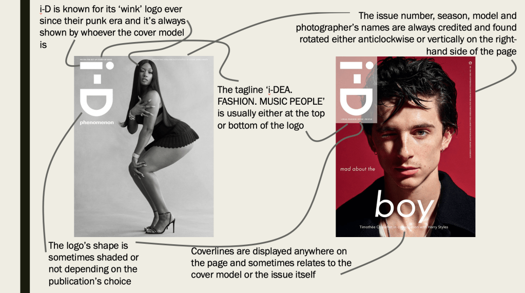
I’ve looked at the decade of 2010-2019 and analysed the layout of the covers, what makes i-D magazine stand out.
Below is an analysation of the two i-D covers.
And the main task for the project is to create a 6-10 double page spread that includes place holder text and shoot credits as appropriate to the publication. As mentioned, I noticed that i-D alternates between single to multi images double page spreads and I’ve analysed one double page spread to give me an insight to what to include.