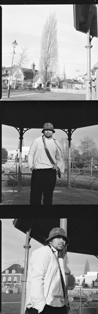
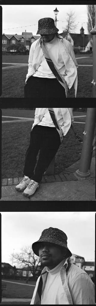
For the layout I decided to go for the single image per page with the exemption of the film photos (below) that I’ll edit to serve as contact sheets.
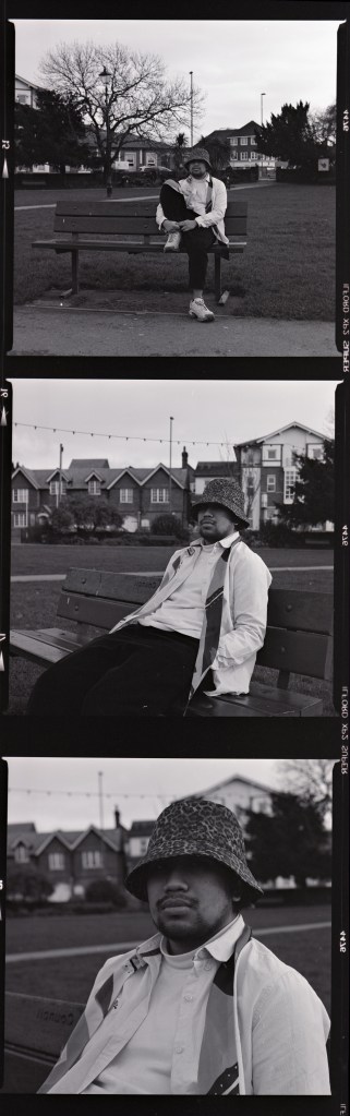
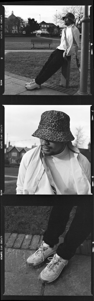
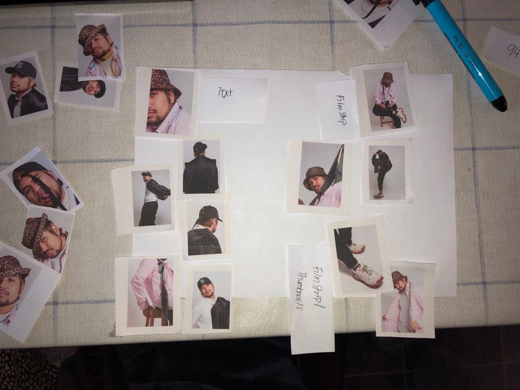
To help me have a better understanding on which pictures to use for my magazine layout I printed out the final edited jpegs into thumbnails as I find it easier to have a physical copy of the images and move them around freely if I ever change my mind.
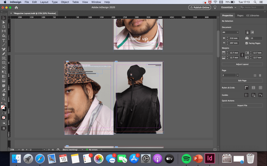
Indesign was a software I didn’t have any prior knowledge with. I was unable to attend the first workshop on the software and the second session didn’t go well due to the internet going down on the day. Therefore, I scoured through myUCA and found a helpful step-by-step on how to use it.
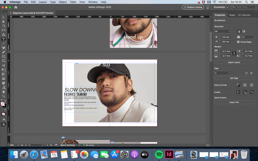
Below are some screenshots during the editing process.
I wanted my magazine layout to sort of replicate the Winter 2018 i-D cover with Timothee Chalamet as to me it stood out the most through its bold typography, layout and imagery.
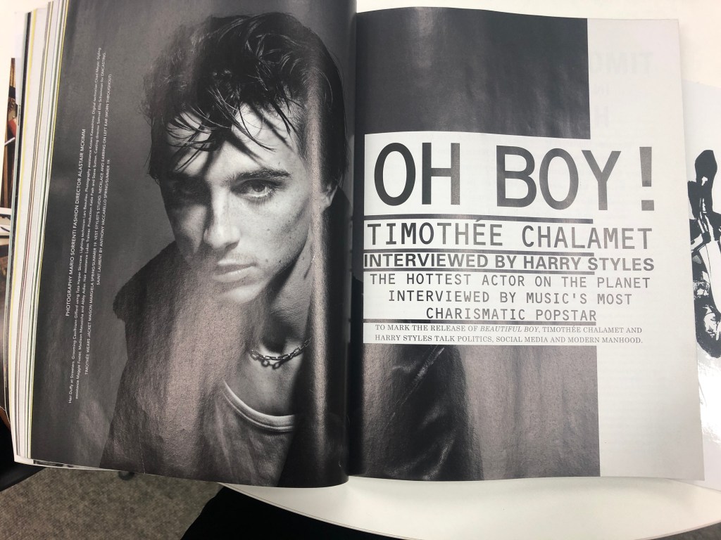
Wanting it to resemble the aforementioned magazine spread, I felt that it didn’t work because it felt too forced or rather I’m plagiarising Mario Sorrenti (photographer) and Alastair McKimm’s (fashion director) artistic choice.
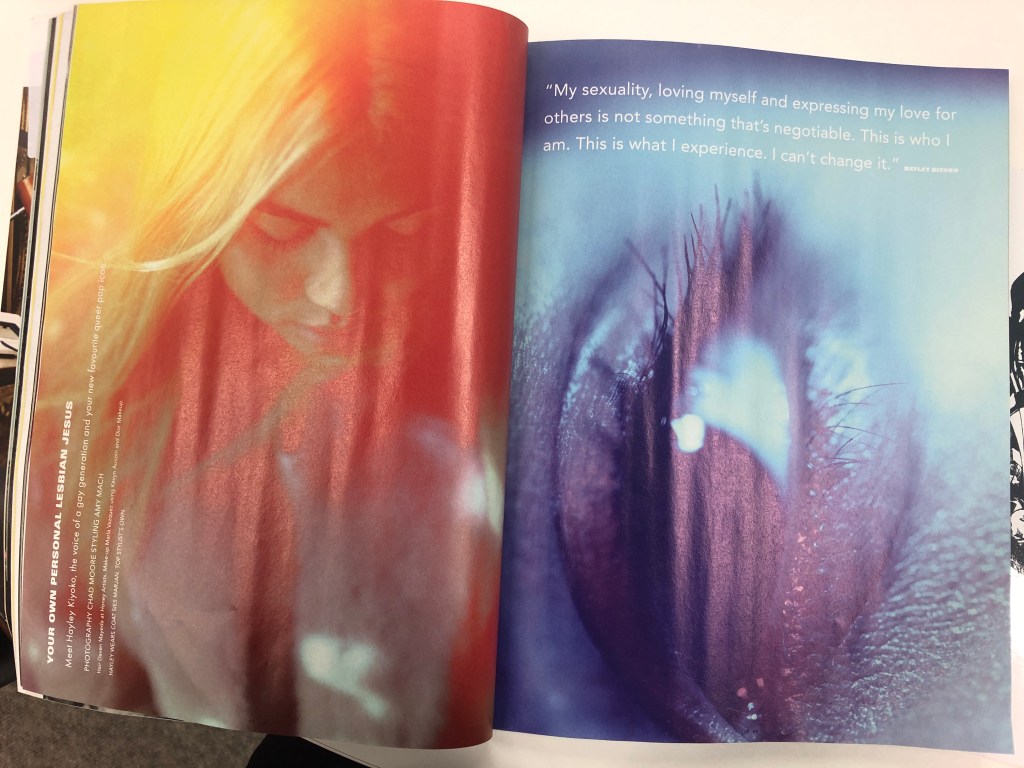
Therefore, I referred back to my printed layout guide to experiment with my own spread and opted for the simple and subtle route like Hayley Kiyoko’s spread below.